An overview of my work
Welcome, dear readers. You're about to get a glimpse into some of my favourite projects.
Grab a coffee, have a nosy, and if something catches your eye there's plenty more where that came from.
carry on scrolling for the overview or click below for individual projects :)
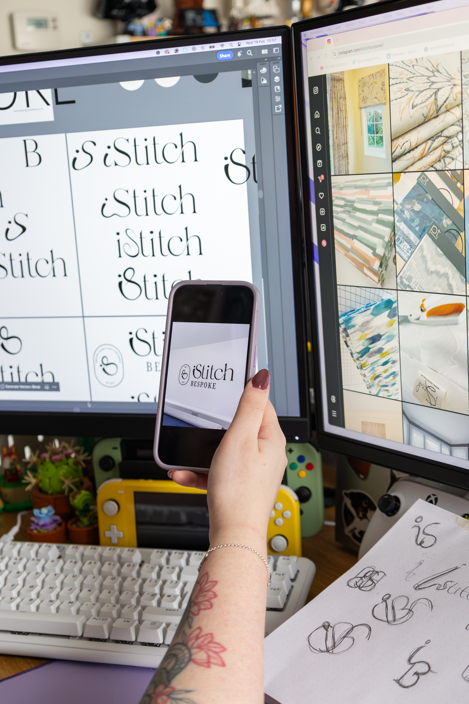
The visual identity was crafted to reflect the premium, handcrafted nature of the business, with a logo mark formed from the letters I, S, and B, interwoven with a thread-like shape. The result is elegant and refined, with a subtle sense of play that nods to the creative, personal touch behind every piece. The use of a minimal colour palette and thoughtful typography round out the visual identity.
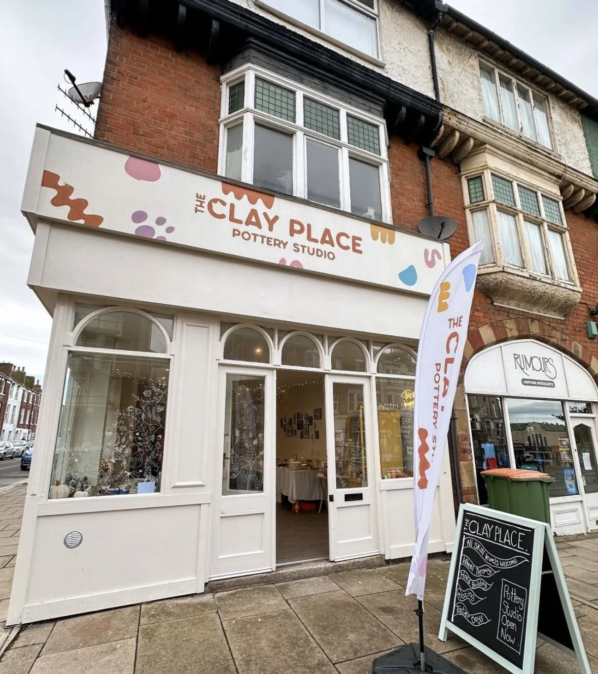
This visual identity was created for a physical pottery studio with a fun nature. Built around the client’s personal branding as a potter, the visual identity keeps things vibrant, playful, and full of personality.
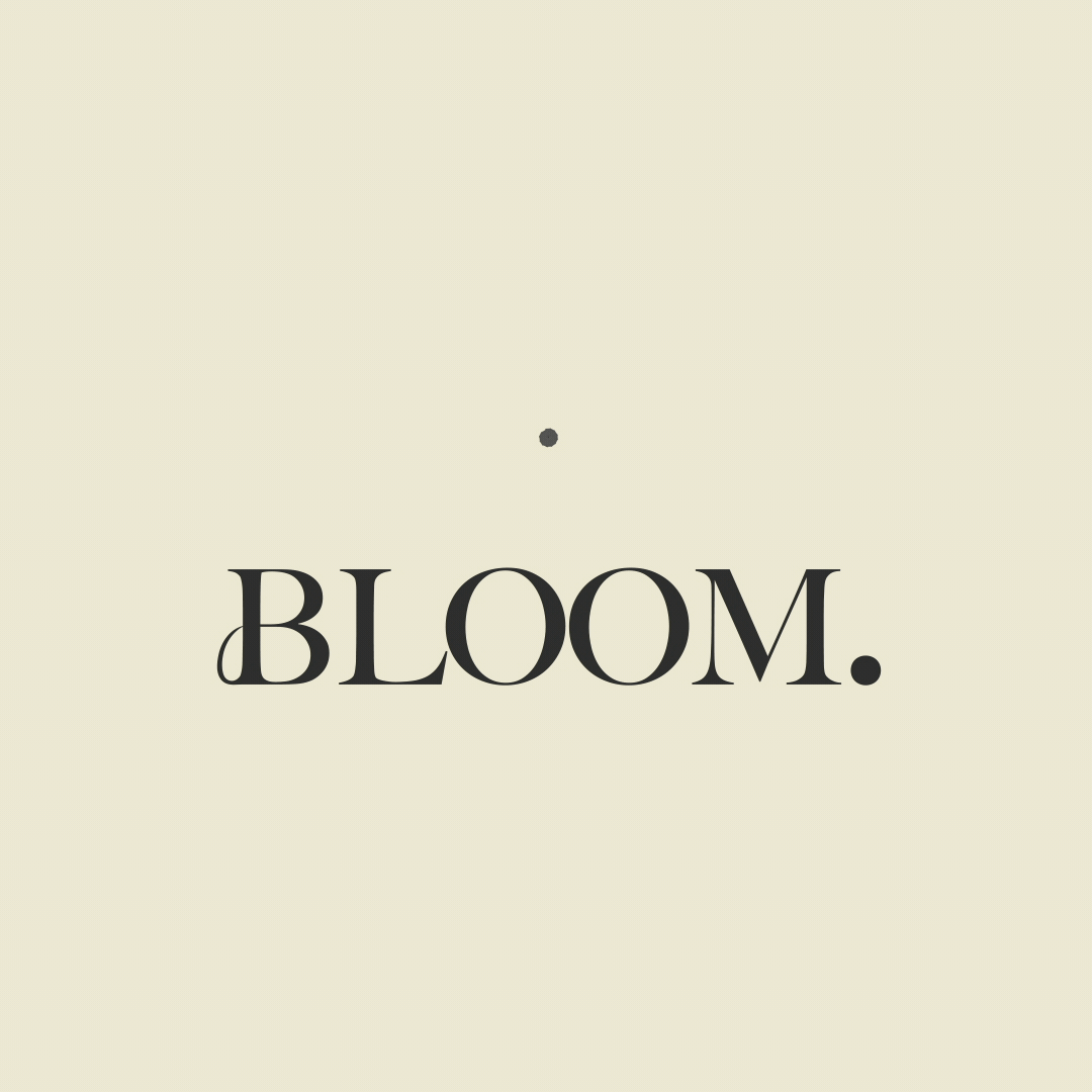
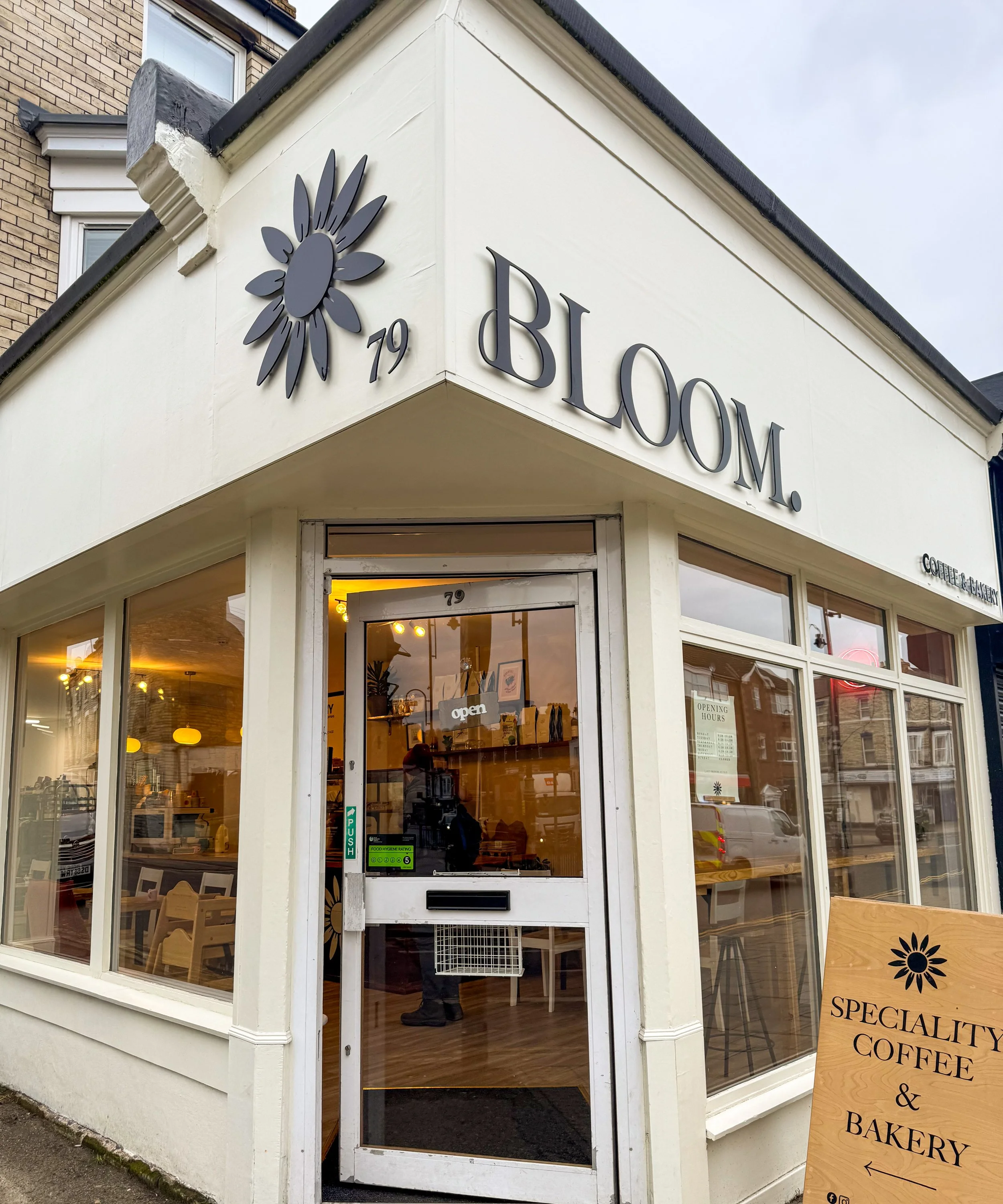
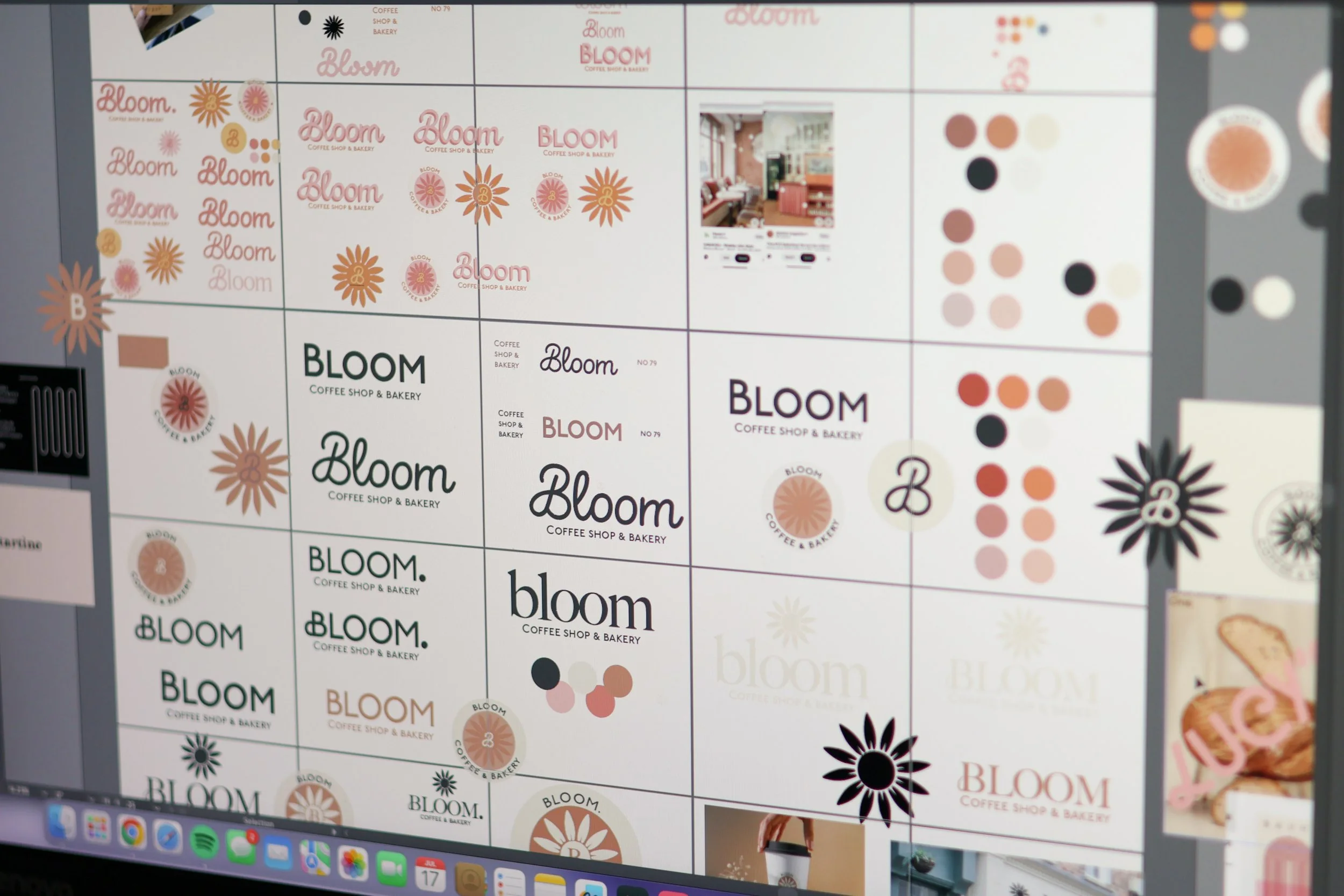
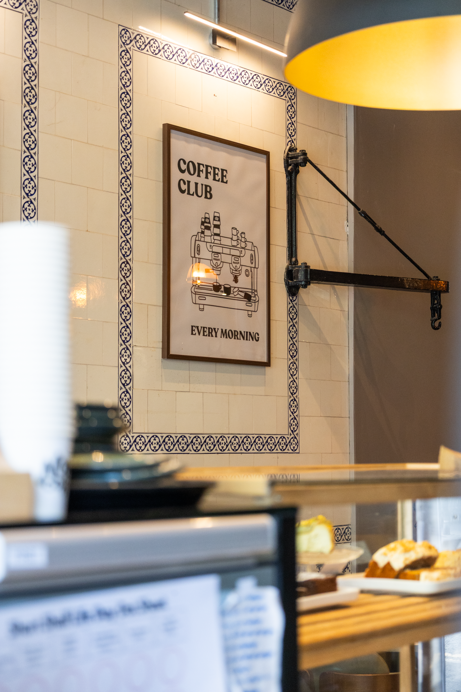
Creating a full visual identity for Bloom for moving into their new premises. The rebranding includes the development of a primary logo, secondary logo, submark, and logomark, ensuring a cohesive visual identity.
I choose to create the ‘B’ with a handle like curve to match a coffee mug handle and re incorporated the sunflower design they had originally into a new simpler design to match the rebrand.
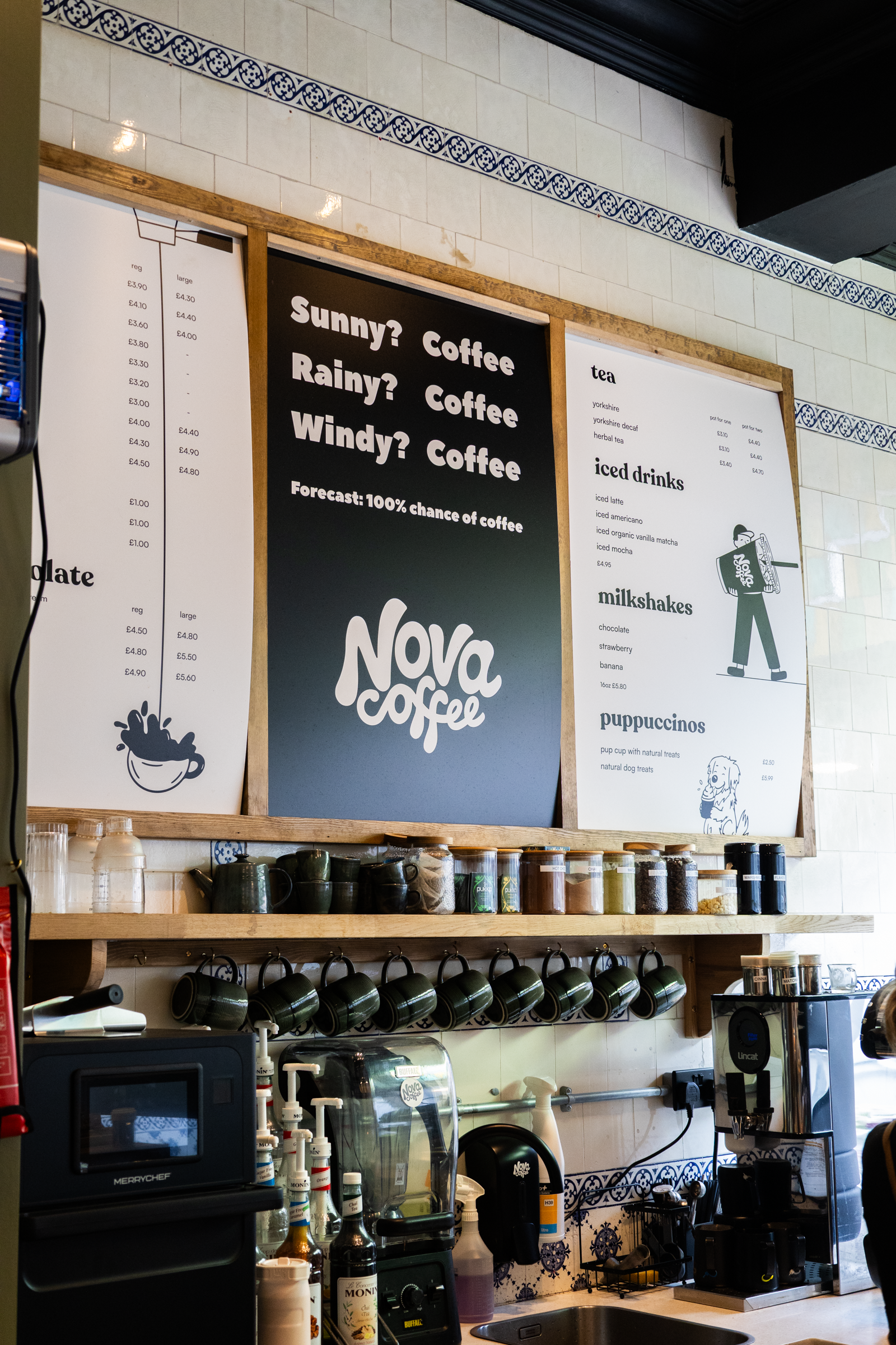
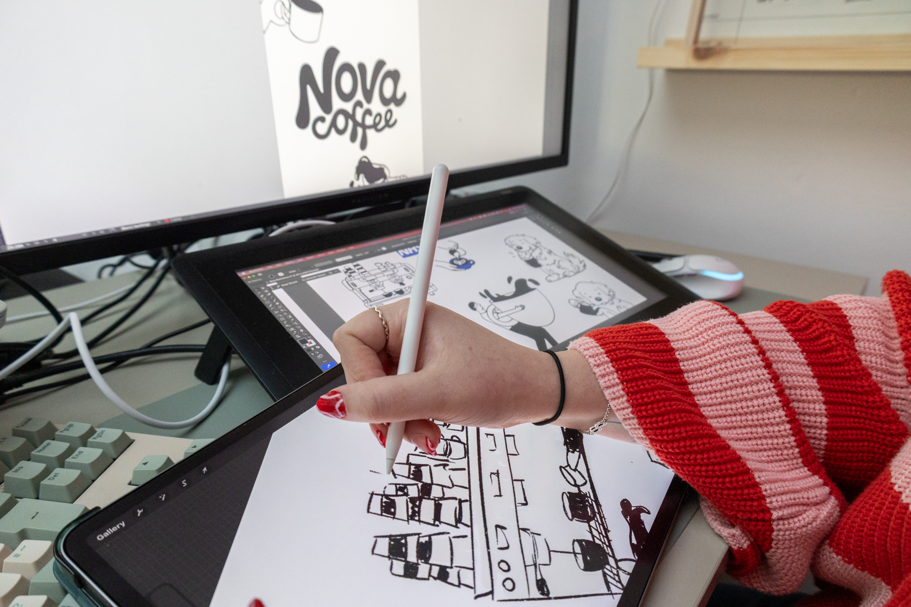
The goal was to create a brand that felt consistent and full of personality while staying true to what they’d already built. I created a collection of illustrations for Nova to match their existing branding and bring in a playful, handcrafted feel.
Along with designing menus, posters & Aboards.
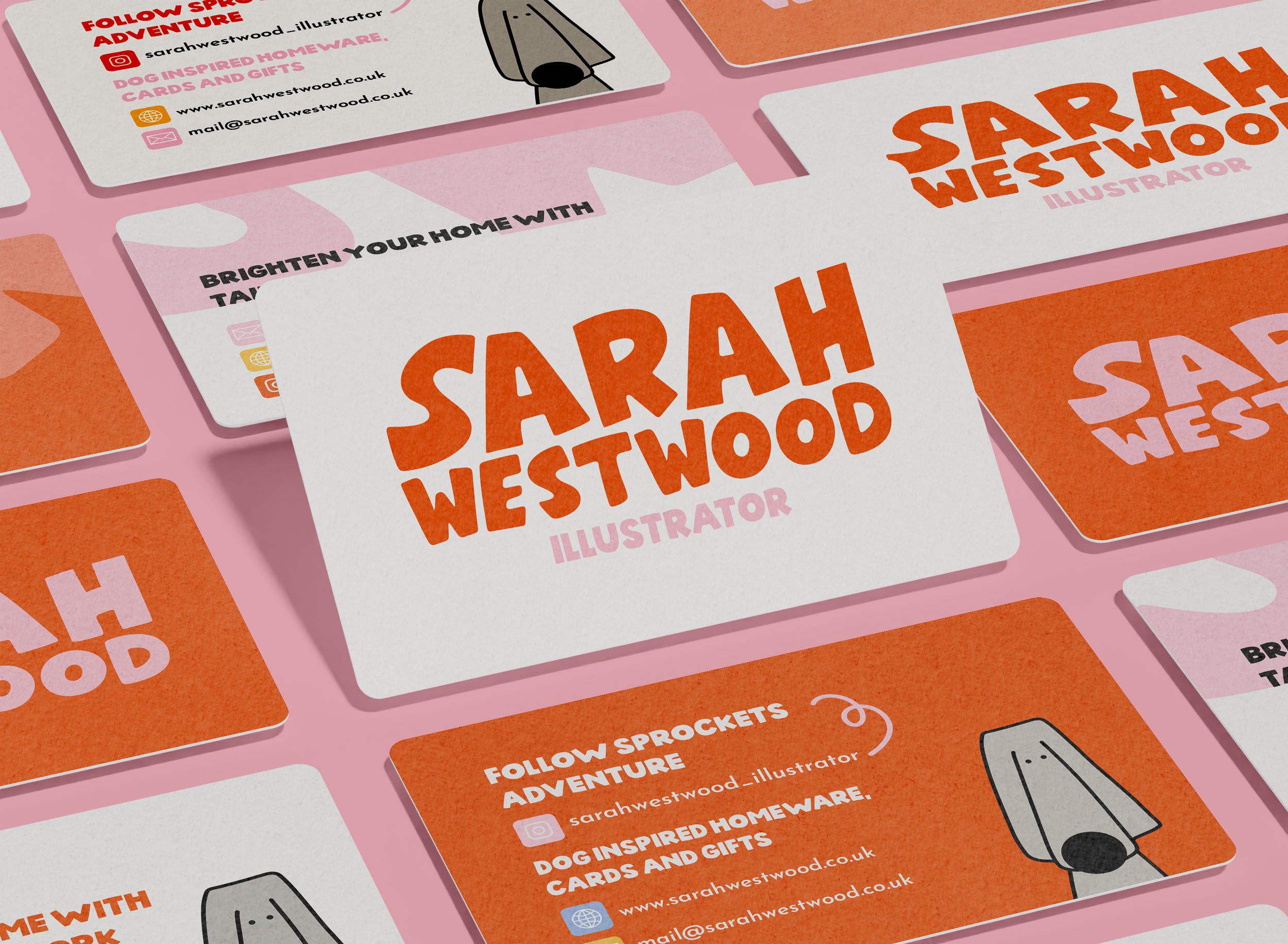
Bright colors, custom illustrations, and matching icons for Sarah to bring everything to life. The logo includes a subtle nod to a dog’s nose in side profile, giving it a clever and ownable visual twist. The typeface has been altered to feel friendly and fun.
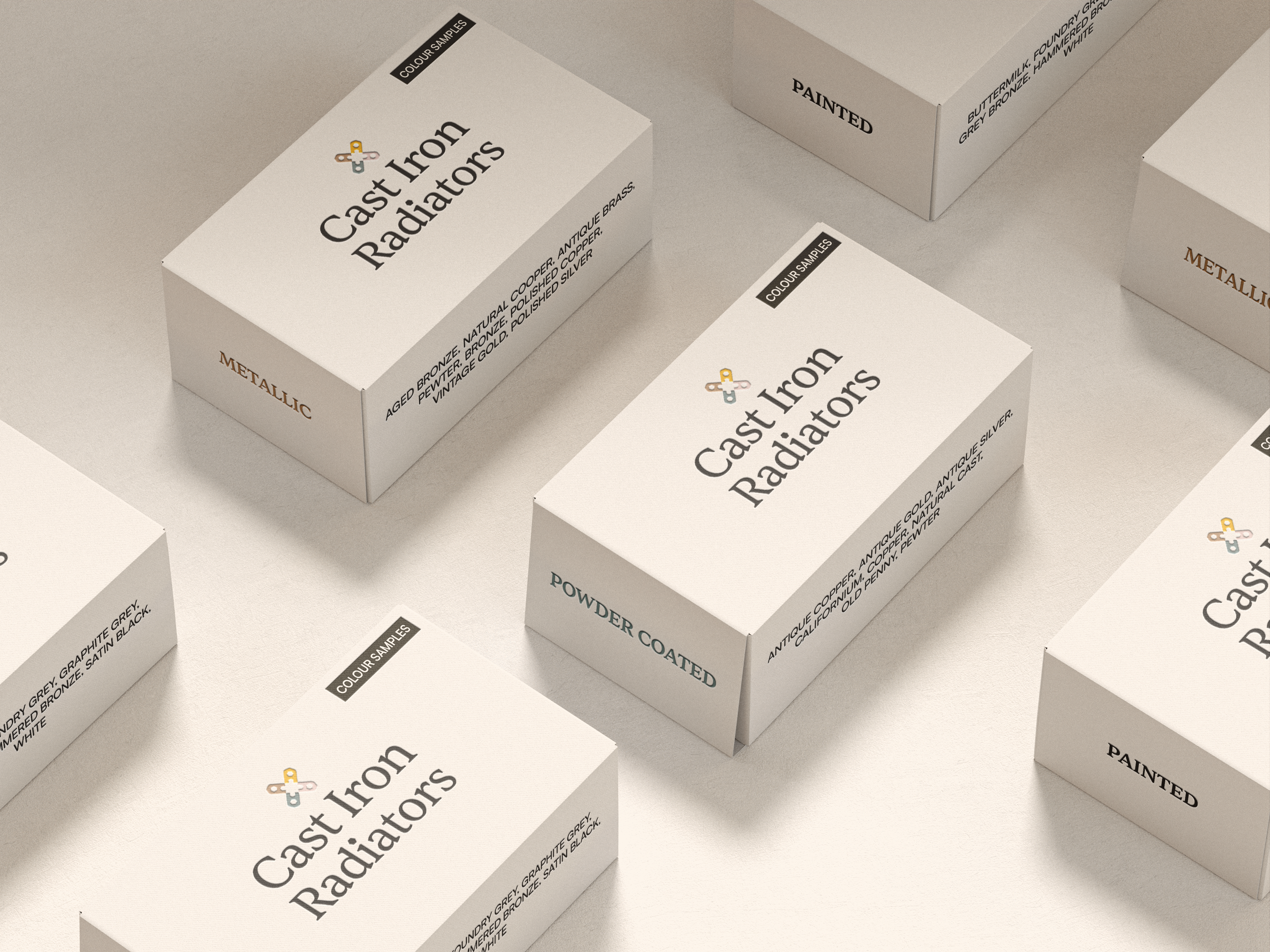
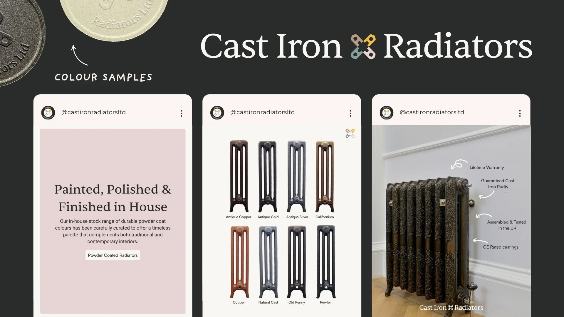
I developed a brand identity that’s rooted in the product itself. Every visual detail is inspired by real components like bush ends, bolts, and the iconic column gaps found in cast iron radiators.