

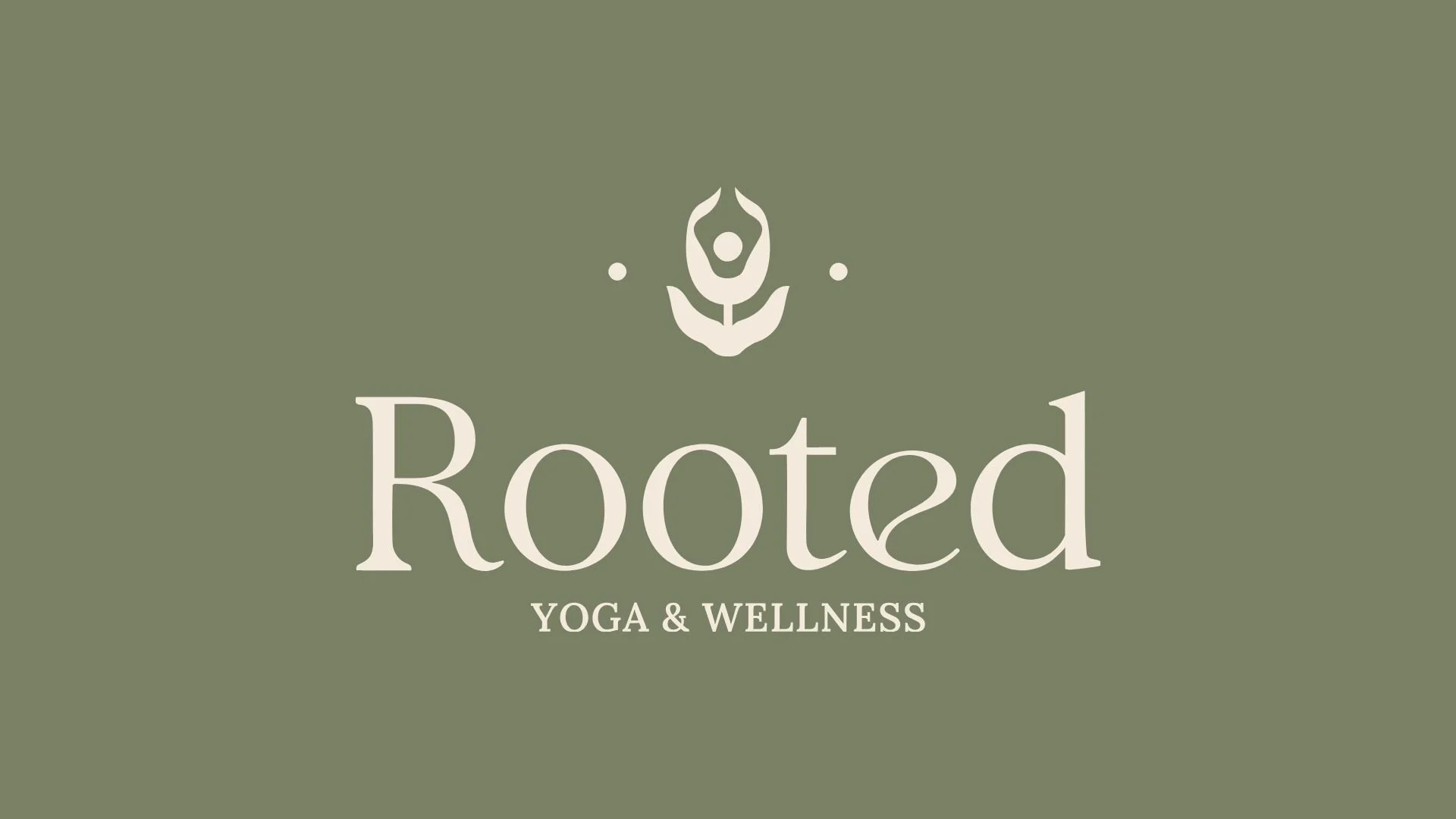
OverviewRooted is a yoga brand, grounded, warm, natural and quietly confident, a brand for someone who takes their practice seriously without taking themselves too seriously.
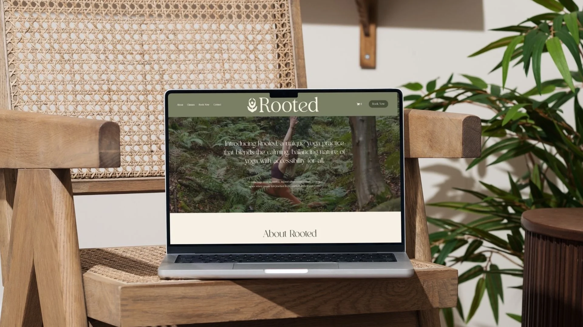
The BriefA full visual identity with a palette rooted in nature, warm neutrals and earthy tones, a clean typography system and a logomark that felt both symbolic and considered, something that could carry the essence of yoga without being obvious or clichéd about it.
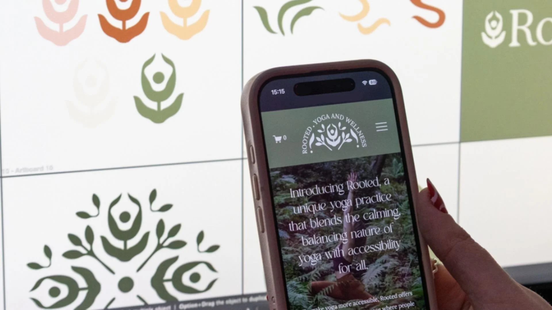
The IdeaThe logomark is where the real thinking lives, a lotus flower whose petals are shaped to embody a yoga pose within the form, so the symbolism is layered rather than literal, you see the flower first and then you see the person, and that quiet reveal is exactly right for a brand called Rooted, something that rewards a second look, the palette sits in the same contemplative space, Sage greens and warm creams, terracotta and blush, everything pulled from the earth and sitting together with real harmony, nothing competing, just a considered collection of tones that feel like a deep breath, and Lora for headings brings a gentle serif warmth with Raleway and Gill Sans keeping everything clean and grounded underneath it.
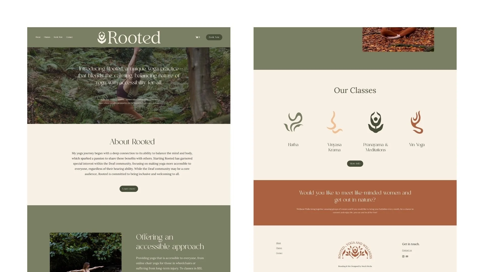
What they gotFull colour palette across six earthy tones, typography system across three fonts, logo suite including the lotus pose logomark, brand at a glance guidelines sheet.