OverviewAAC & Me is a specialist AAC and Assistive Technology consultancy providing assessments, teaching and training to AAC users and their support networks, helping embed AAC into daily life for children, young people and adults across North Yorkshire, and after a year of operating the business was at a natural turning point, developing into a foundation model with two distinct but connected arms, AAC & Me Ltd providing the professional consultancy side and AAC & Me CIO providing community access to AAC clubs, family support and wider network advice, both serving the same people but in fundamentally different ways.
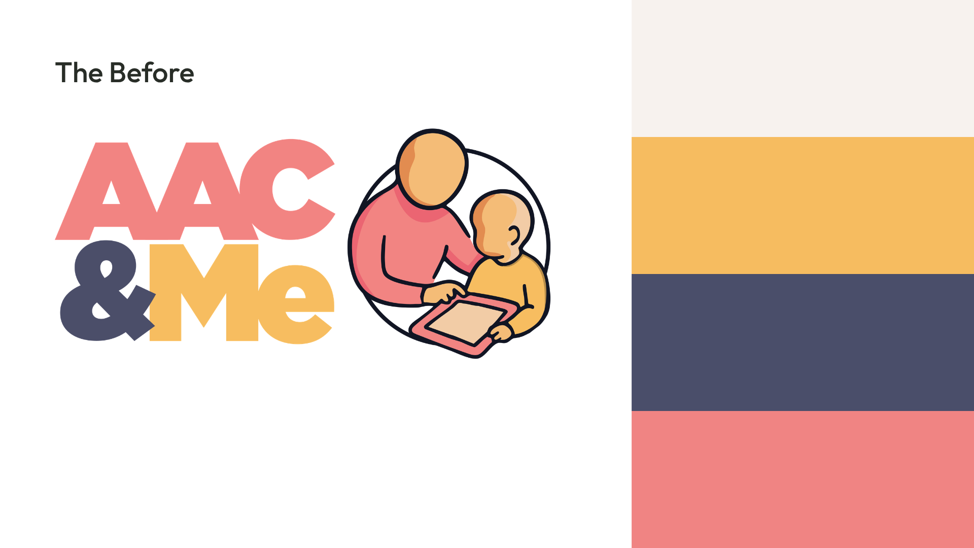
The briefBrand development to support that growth from a single business into a two-arm structure, making sure the identity could hold both without one overshadowing the other, communicating clearly who each arm is for and what it does, while keeping the warmth and connection that runs through both, and reflecting the full age range of AAC users from children right through to adults, because that breadth was important and needed to be visible rather than implied.

The IdeaThe colour split does the heavy lifting in distinguishing the two arms, Slate Grey and Coral anchoring the consultancy side with a professional, considered feel, and Coral and Yellow bringing energy and warmth to the community and clubs side, with Coral acting as the connective tissue between them so the two always feel like they belong to the same family even when they're doing different things.
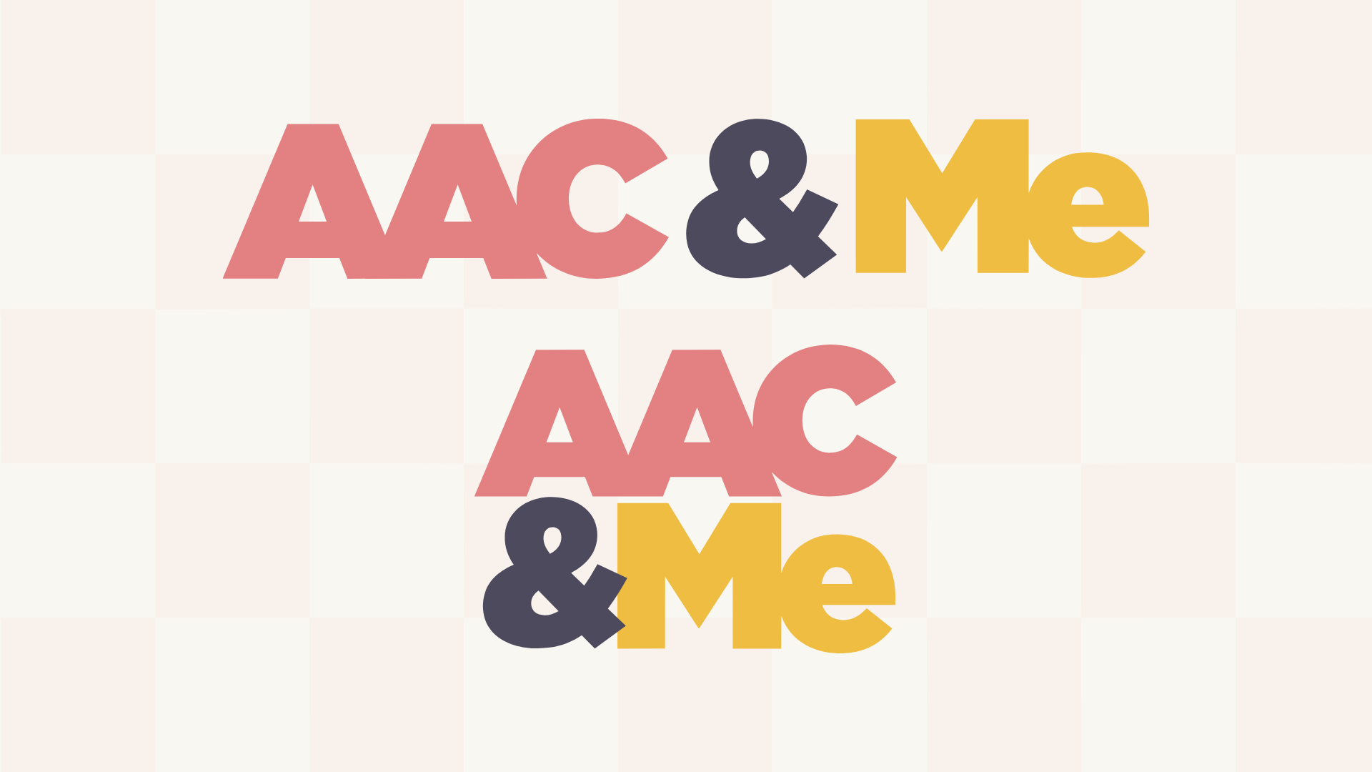
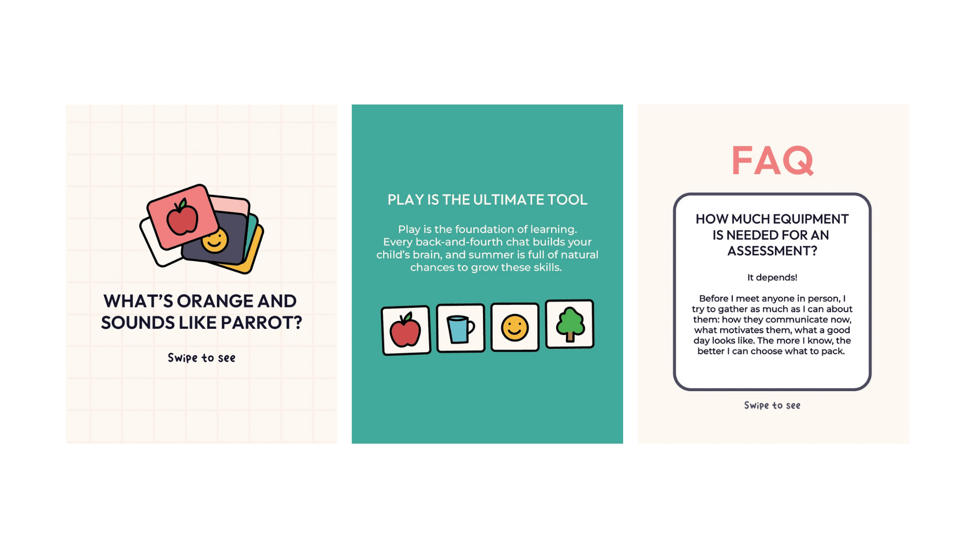
The AssetsThe illustrations were built to reflect the full range of people AAC & Me works with, children and adults, AAC devices in hand, communication happening in real moments, and the community posts lean into that playfulness with the Tangerine handwritten font adding a human, personal touch that the more formal consultancy content steps back from. Two patterns, a grid and a checkerboard, give both sides something to work with as a background texture, subtle enough not to compete with content but distinct enough to add depth and personality
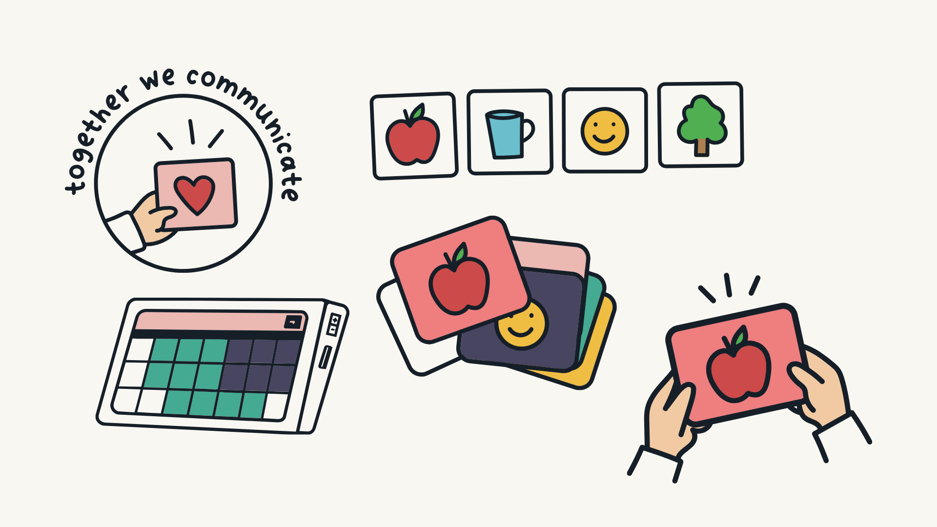
what they gotExtended logo suite with variations across both Ltd and CIO arms, updated colour palette with deliberate split across the two business sides, three font typography system, bespoke illustration set reflecting the full age range of AAC users, two SVG pattern assets, social media templates for both consultancy and community content, updated brand guidelines.