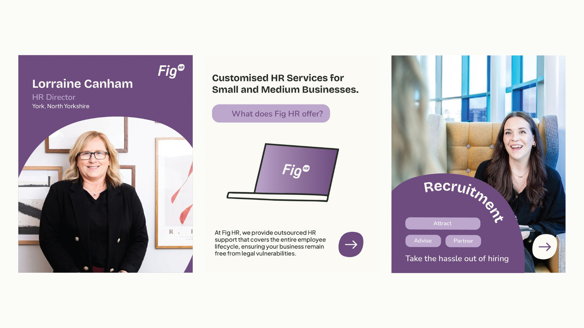
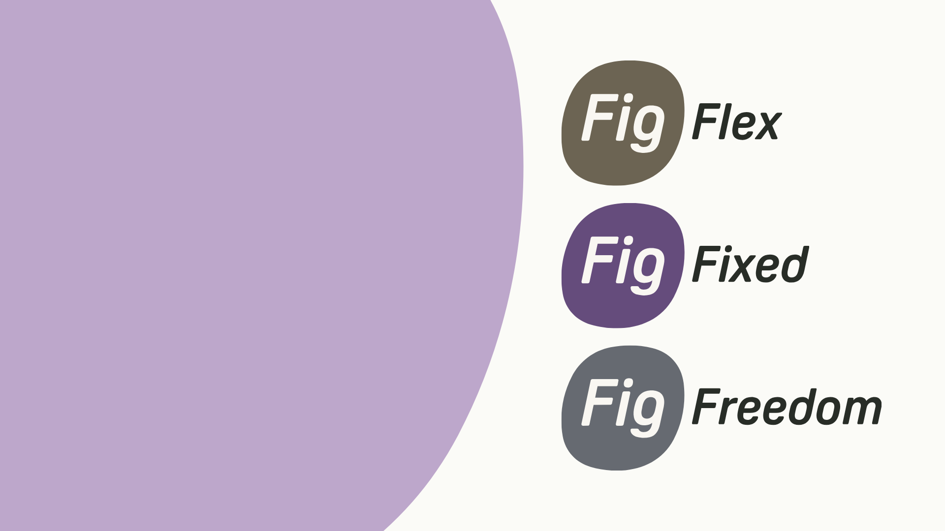
OverviewFig HR is a Yorkshire-based HR consultancy offering outsourced HR support across three service products, Fig Fixed, Fig Flex and Fig Freedom, covering the full employee lifecycle for small and medium businesses. The brand had been running for two years with a clean, considered identity, but something was missing, as the founder put it, it worked but felt soulless, and they wanted to inject some fun and warmth without losing the professionalism that makes clients trust them with something as serious as HR.
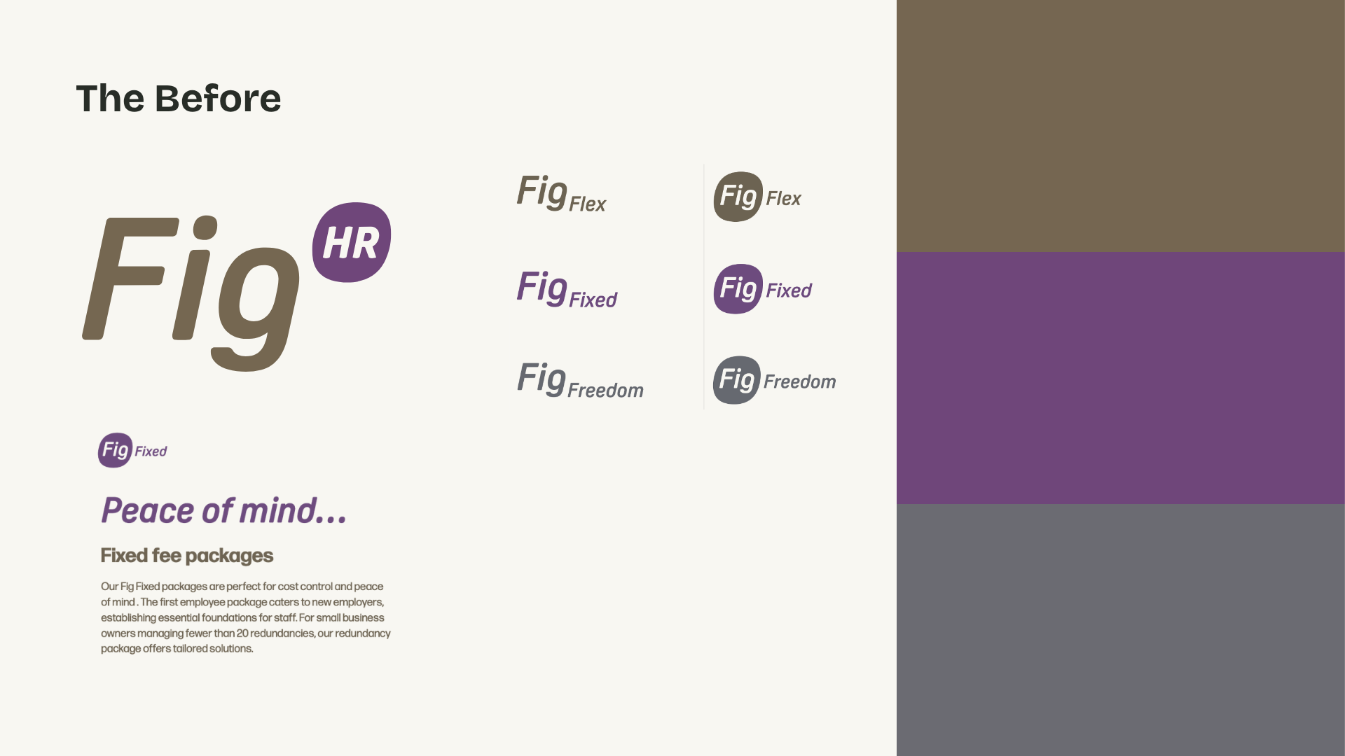
The BriefBrand development rather than a full rebrand, keeping what was working and building on it, bringing the existing identity to life with more personality, more visual tools and a system that could actually work across social, documents and marketing without looking flat or inconsistent.
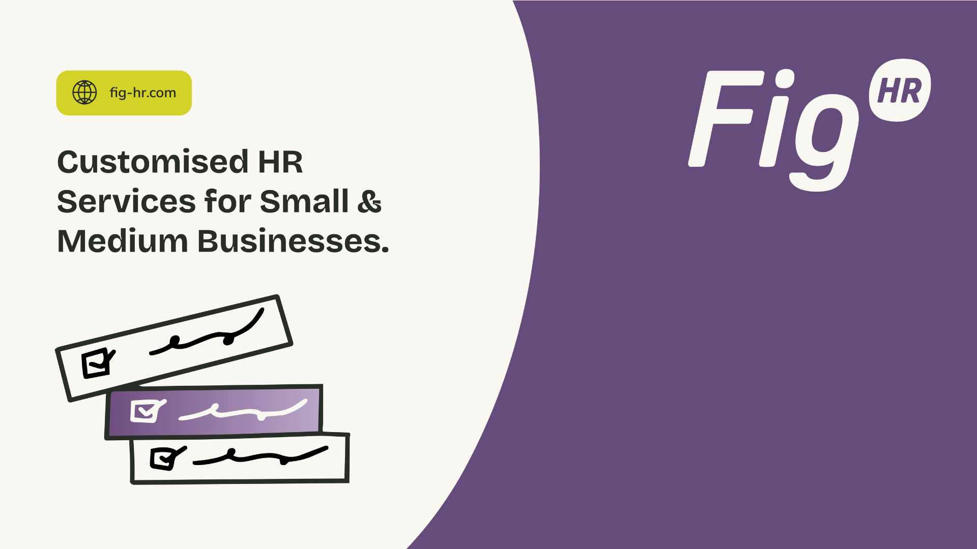
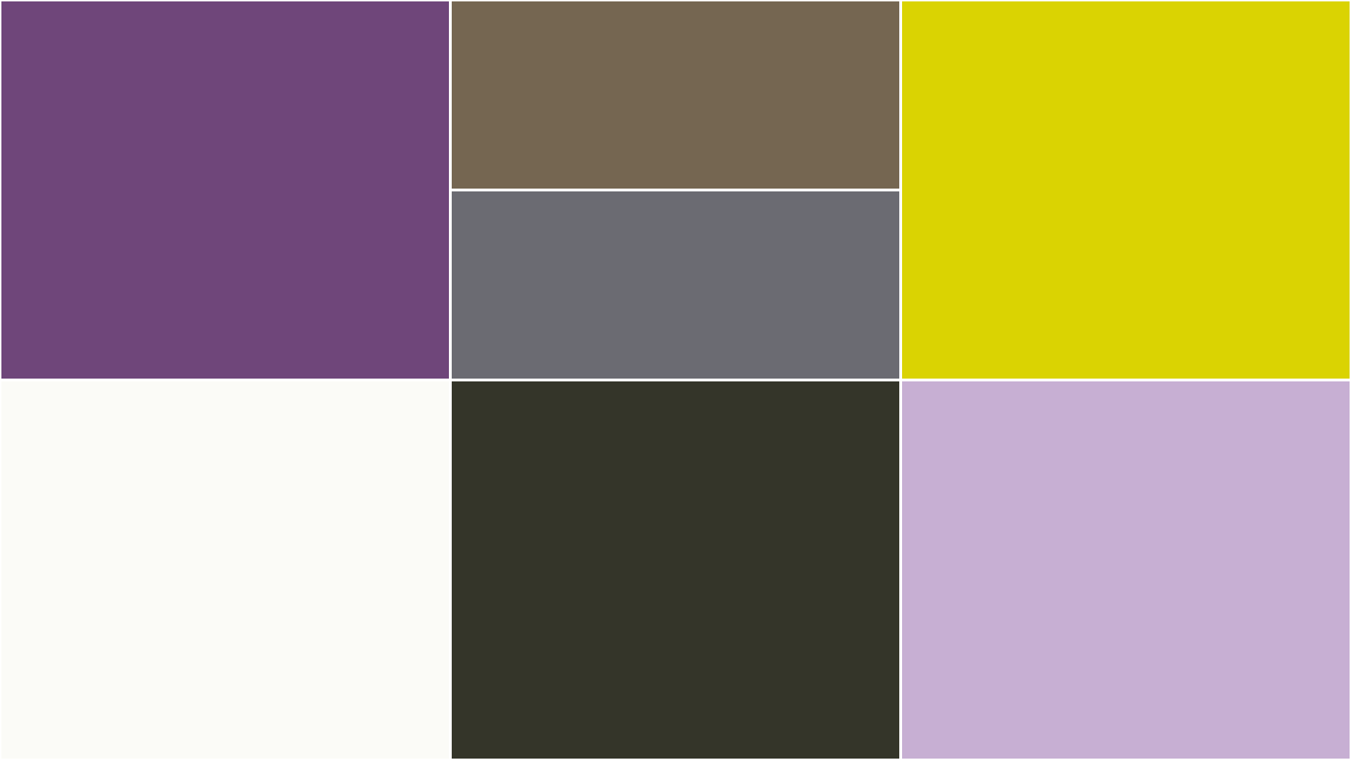
The IdeaThe logo stayed, the sub-brand structure stayed, the lozenge shape stayed because it's a genuinely lovely bit of kit, but everything around it got richer and warmer, starting with the colour palette which gained a warm white and a warm off-black as proper foundations, a soft lavender pulled from the logo lockup, and an electric lime accent for pops of energy, gradients and CTAs, the kind of colour that makes you look twice without being loud.
The fontsThe old brand had been using the logo font as the heading font too which it didn't need to do, so headings became Bricolage Grotesque for character, subheadings Nunito to echo the roundness of the logo, and body copy Plus Jakarta Sans to keep it clean and readable.
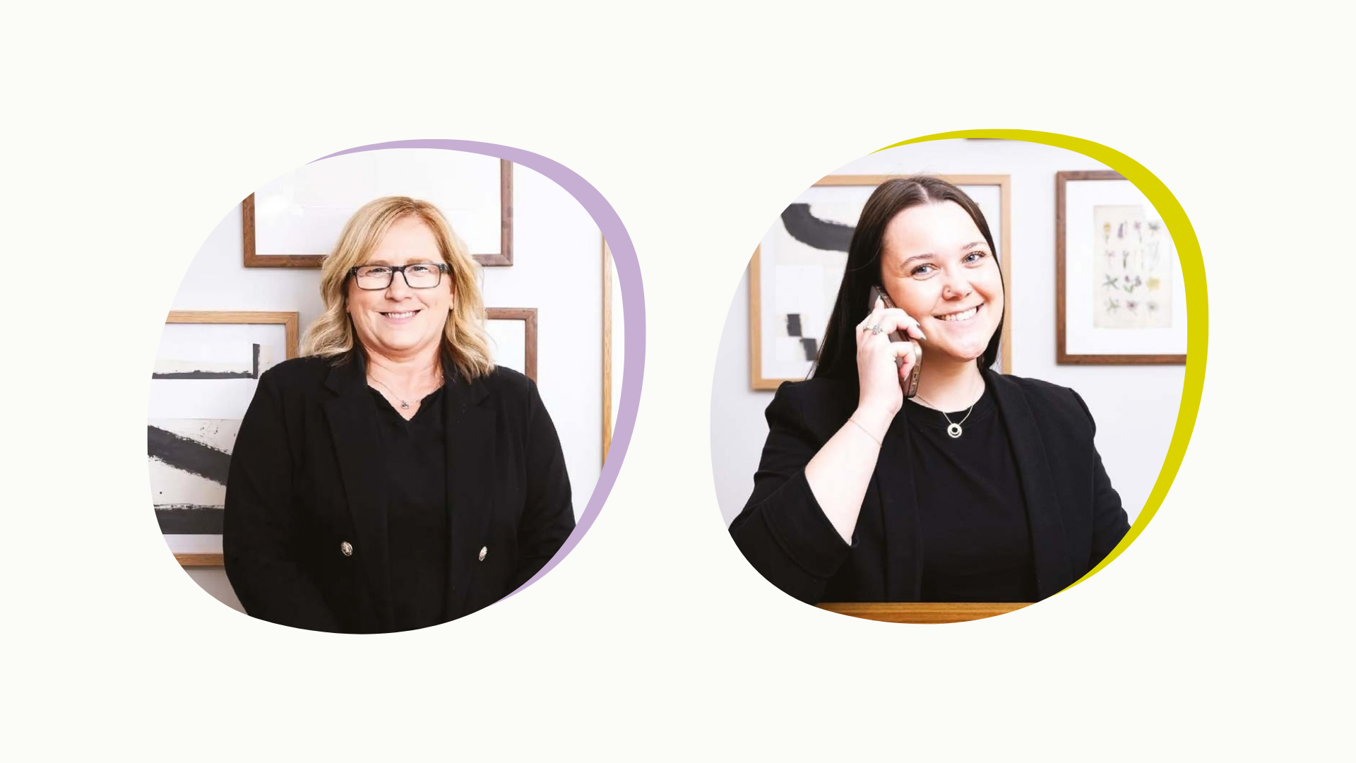
The AssetsThe gradient icons keep the simplicity of the original brand but bring it to life so it feels friendly and human rather than flat, and the rounded HR holding shape was leaned into further, framing photos, sitting in corners as a brand marker and pointing along as arrow CTAs, because that rounded, friendly quality was always one of the brand's biggest strengths.
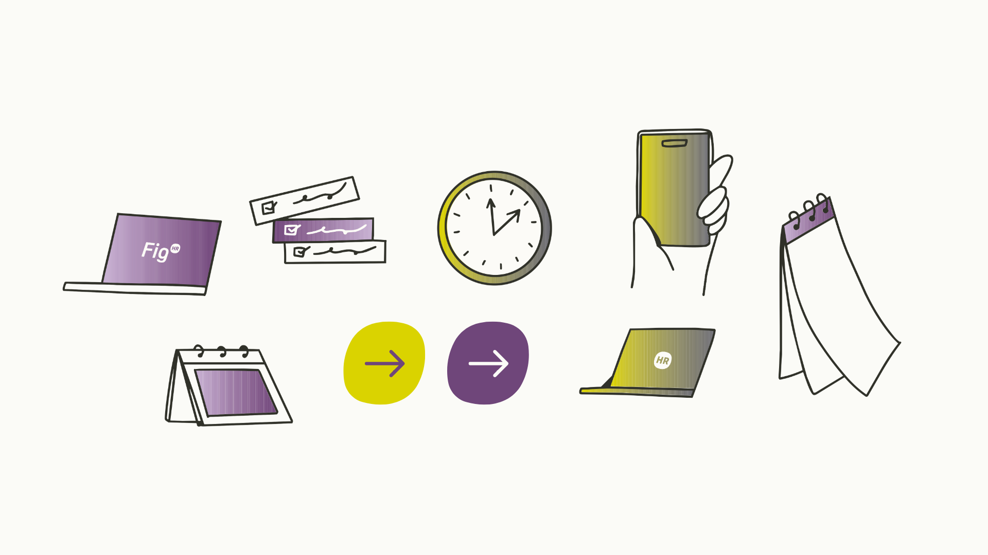
What they gotUpdated colour palette with seven colours including new warm white, off-black, soft lavender and electric lime, updated typography system with three fonts, expanded graphic icon suite with gradient treatment, updated logo colour to match the new off-black, social media templates, updated brand guidelines sheet.