

OverviewBridget Wilkinson is a professional artist based in Whitby, North Yorkshire, working from her home studio since 2006. Bold, colourful paintings inspired by the coast, the world beneath the waves, and a deep love of colour. Her work sells locally, nationally and internationally, and she creates everything from original paintings to prints, sculptures and found object pieces. The art was already brilliant; the brand needed to catch up.
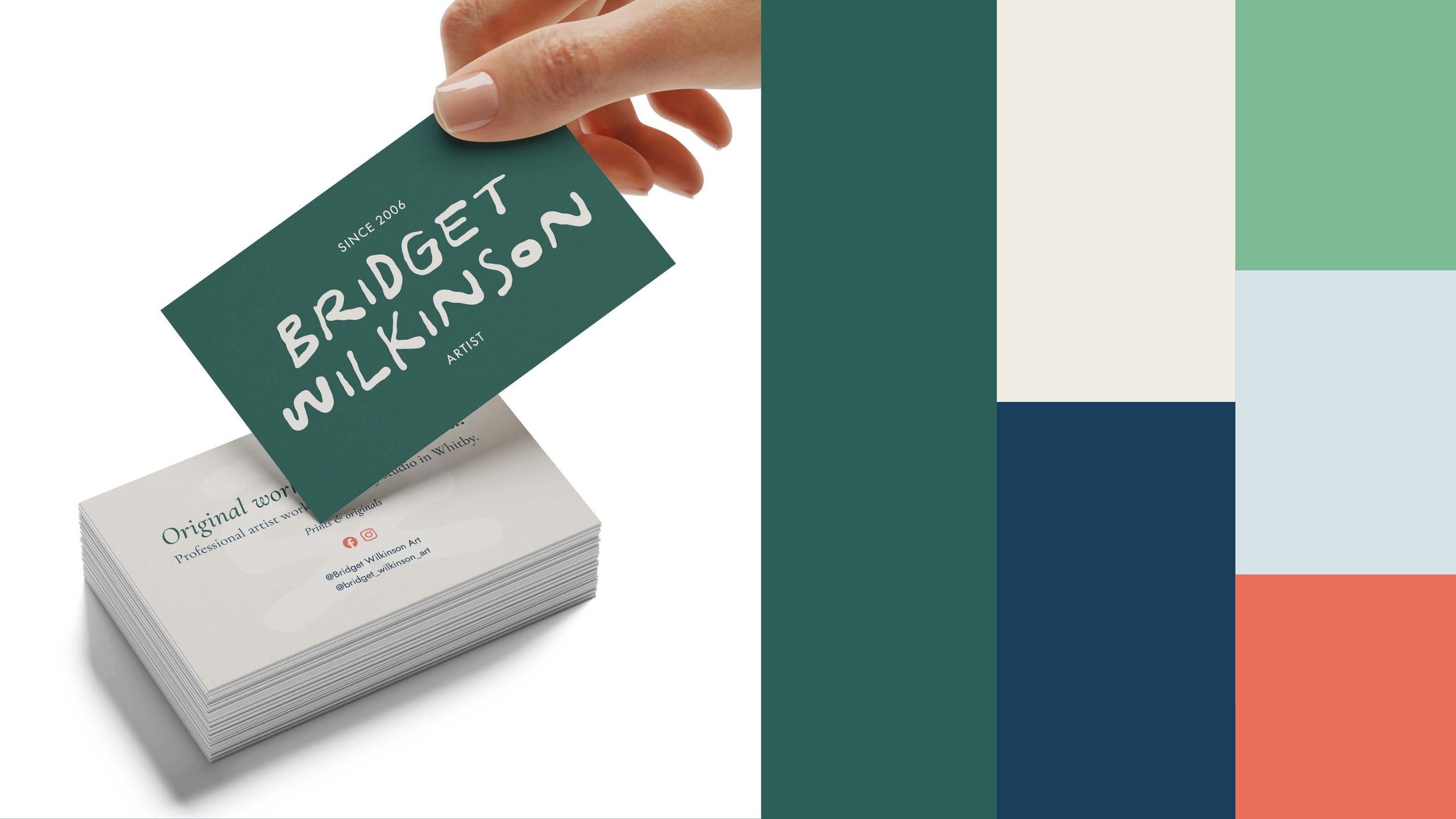
The BriefA visual identity through the Oh Hello package. Something that felt as expressive and handmade as the work itself, without tipping into messy or unprofessional. It needed to work across a website, business cards, print labels, packaging and social, and it needed to feel unmistakably like Bridget without ever overshadowing the art.
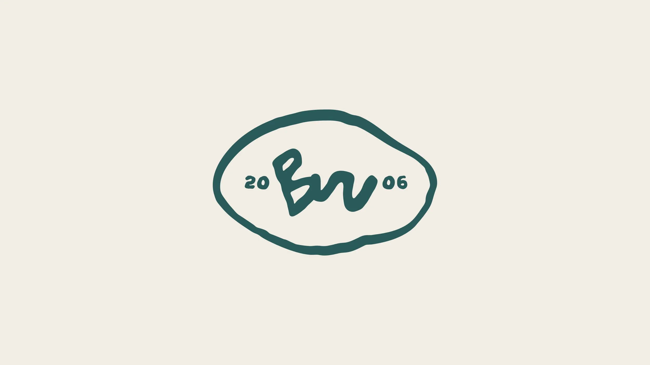
The ideaThe font does a lot of the heavy lifting here and that was entirely intentional. The slight wobble, the organic weight, the texture in the strokes, it tells you immediately that this brand belongs to someone who works with their hands. The B and W were adjusted specifically to make the typeface unique to Bridget rather than off-the-shelf. The logomark simplifies the initials into a signature flow, the B running into the W, enclosed in an organic hand-drawn shape that works like a traditional maker's hallmark. 2006 sits either side of it, giving the brand its history without resorting to "Est." The whole thing is designed to feel like it could be pressed into clay, stamped onto packaging, or signed into the corner of a canvas. Because it can be.