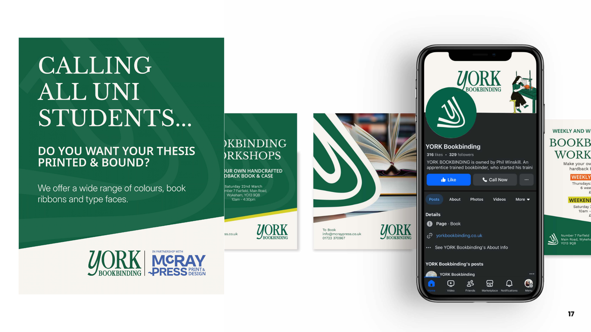
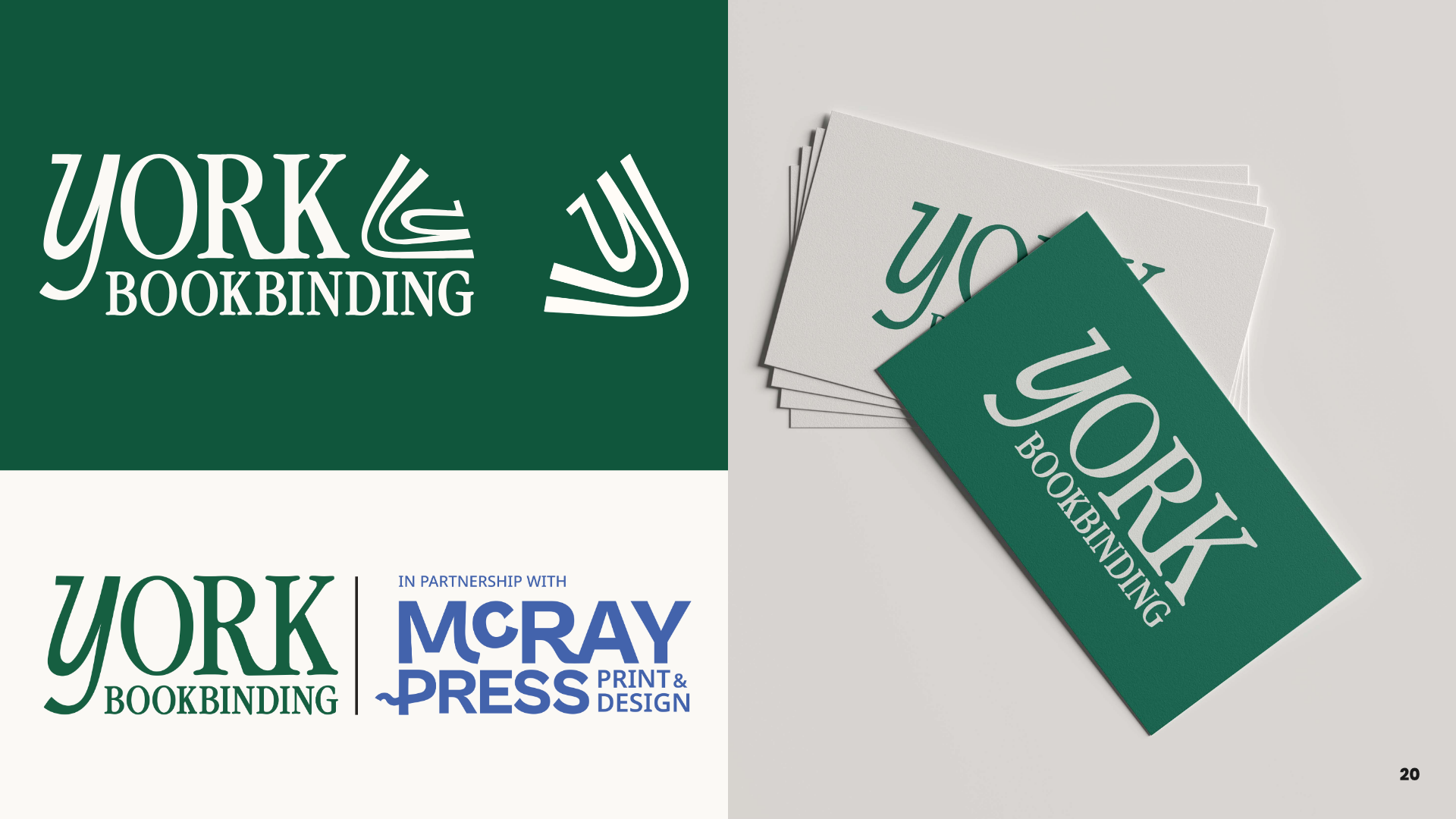
OverviewYork Book Binding sits alongside McRay Press in the same building, owned by the same family. Where McRay handles print, York handles everything to do with books. Restoration, thesis binding, bespoke albums, hand-finished pieces that big companies have no interest in doing.
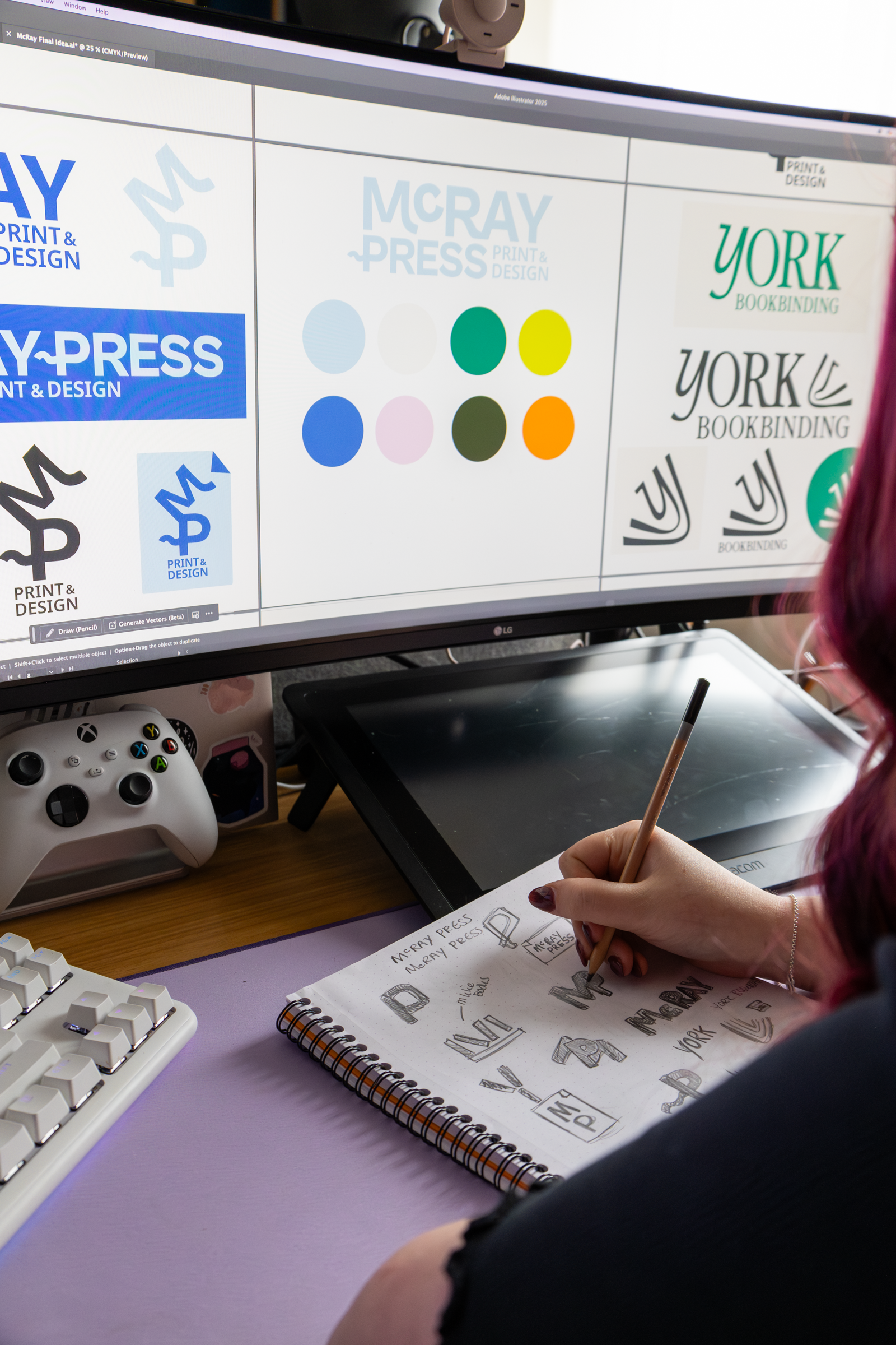
The briefA brand strategy and creative direction that felt premium, heritage-led and trustworthy, while modernising enough to attract a wider audience beyond traditional collectors. The two brands needed to feel like siblings, distinct enough to stand alone but clearly from the same family.
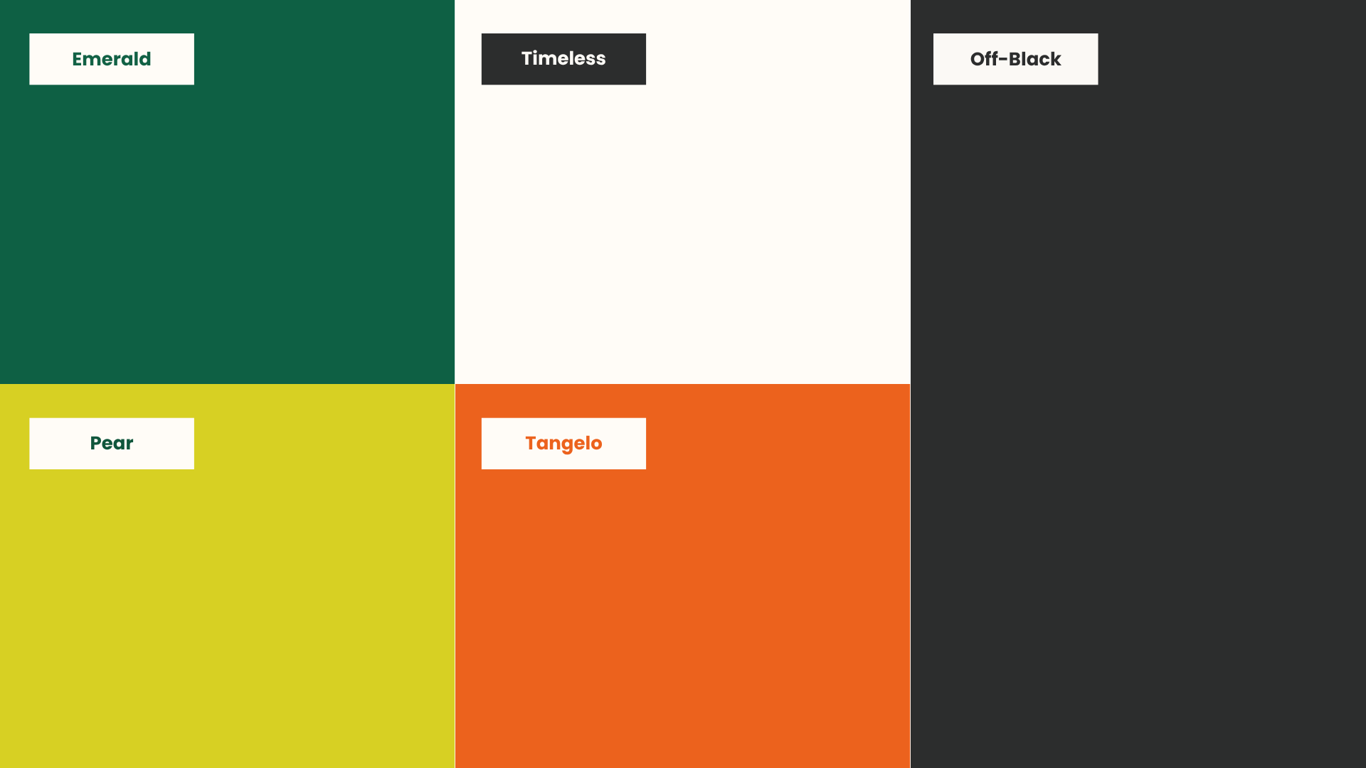
The IdeaWhere McRay leans bold and contemporary, York leans refined and considered. More sophisticated serif typography paired with modern layouts, deep greens and warm browns that feel fresh rather than dusty. Heritage without the stuffiness. The kind of brand that a retired librarian and a young graphic designer would both trust.
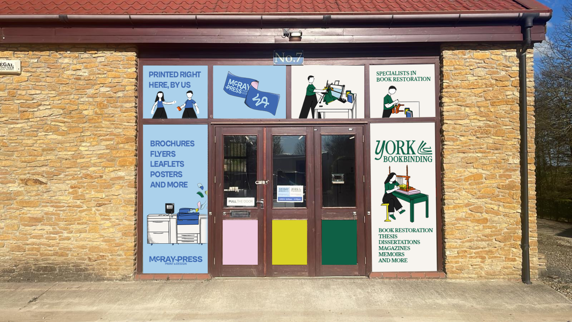
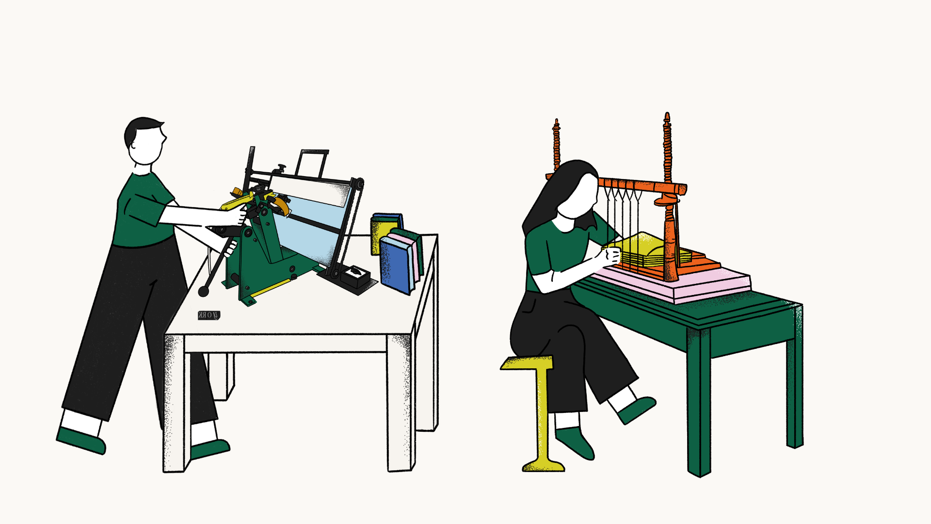
IllustrationsA dedicated illustration set featuring a bookbinder at work, detailed and considered to reflect the craft and care behind the service. Where McRay's illustrations are energetic and bold, York's are quieter and more precise, reflecting the heritage and patience that restoration work requires. The two sets sit together naturally without being identical.
What they gotFull brand strategy document including brand foundations, mission and vision statements, target audience personas, buyer journey mapping, competitor analysis, brand voice guidelines and combined moodboard direction showing how both brands work together.