OverviewLaura Wright is a strategy and policy consultant specialising in rail and transport, helping organisations influence local and national government, and she's fourth generation railway. That's not a detail, that's the whole story, a business built on deep expertise, decades of family history, and a genuine belief that transport policy done well changes people's lives.
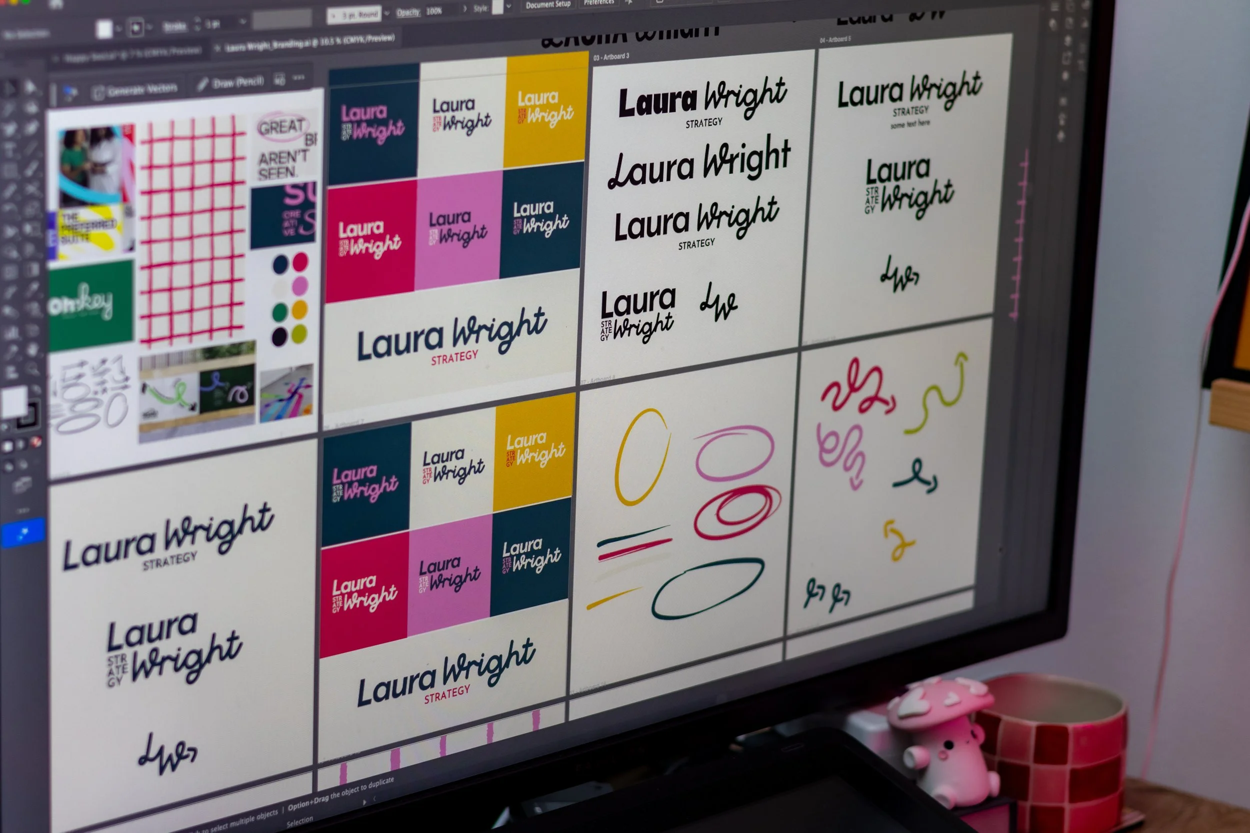
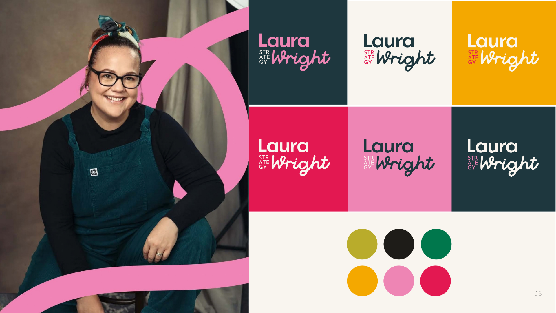
The briefA visual identity for a personal consultancy brand that needed to feel completely different from the usual corporate policy world, clear and confident with a real sense of movement. Laura wanted her personality to be part of the brand rather than hidden behind it, because strategy and policy can feel dry and inaccessible, and this needed to feel anything but.
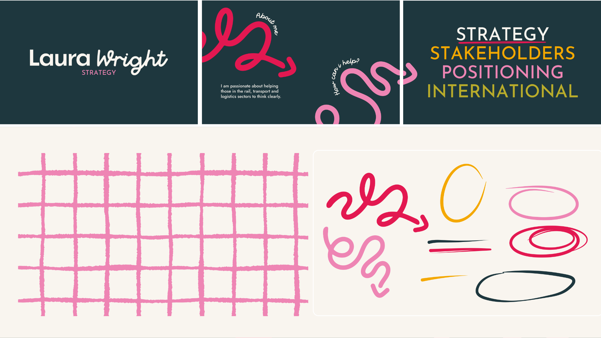
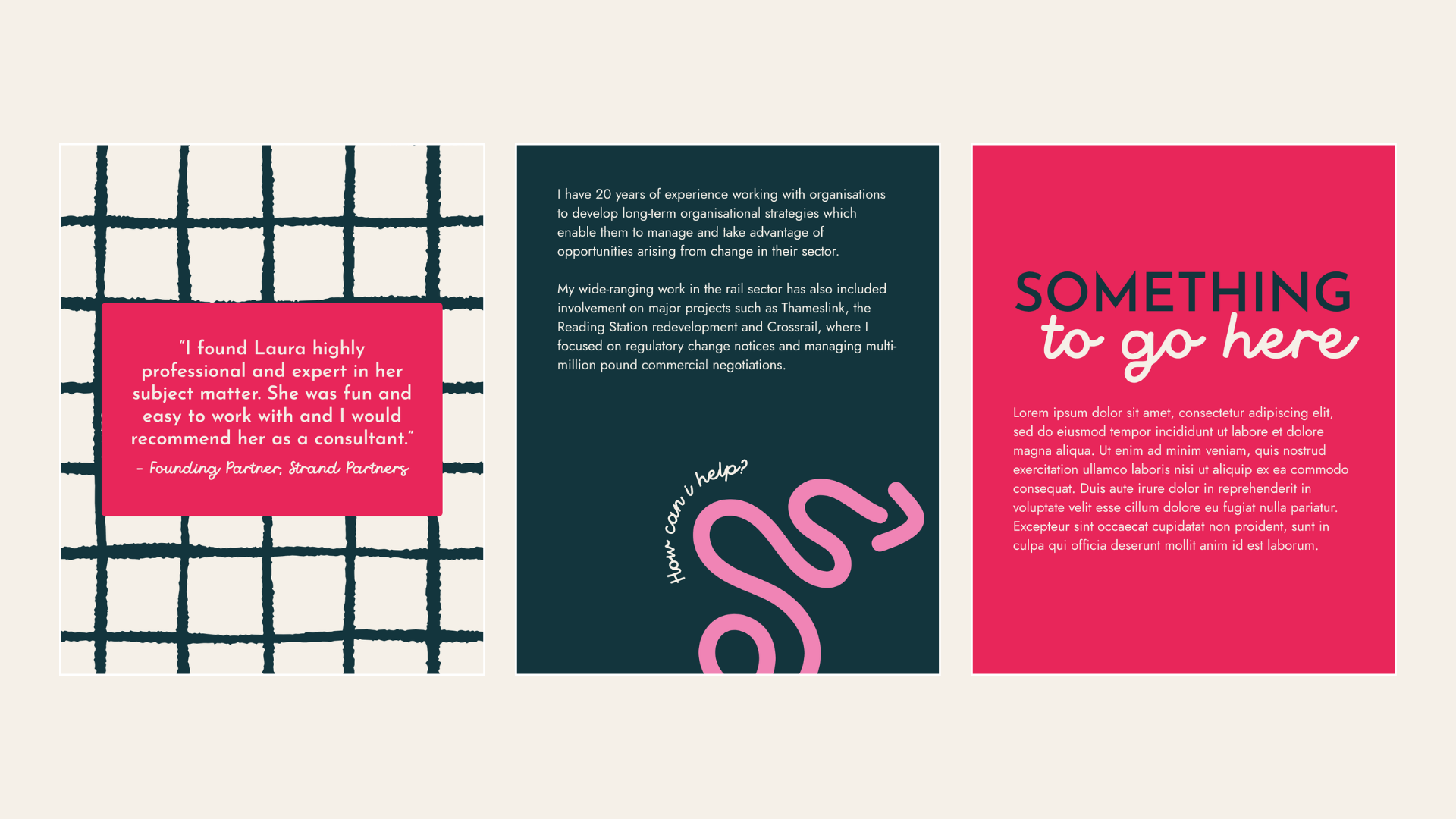
The IdeaMovement runs through everything, in the typography, the shapes, the composition, because a brand for someone who works in transport should feel like it's going somewhere. Extra bold Josefin Sans gives it maximum presence and authority, while the handwritten Rustic Lane counterpoint keeps it human and stops it tipping into corporate, and the tension between the two is exactly the point. Crimson Pink leads with energy, Deep Teal anchors it, and Golden Amber and Olive Gold add warmth and earthiness, with each touchpoint wearing a different colour from the system so the brand feels dynamic rather than rigid. The hand-drawn grid and looping line assets run throughout, adding movement and personality without ever cluttering the layout.
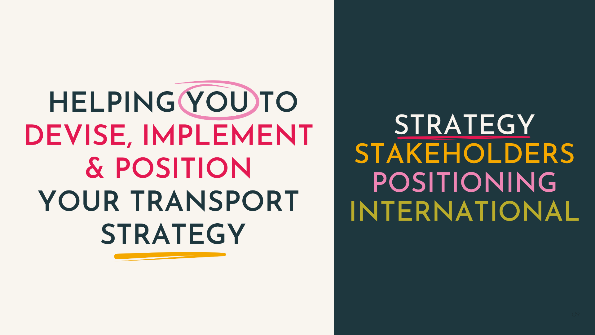
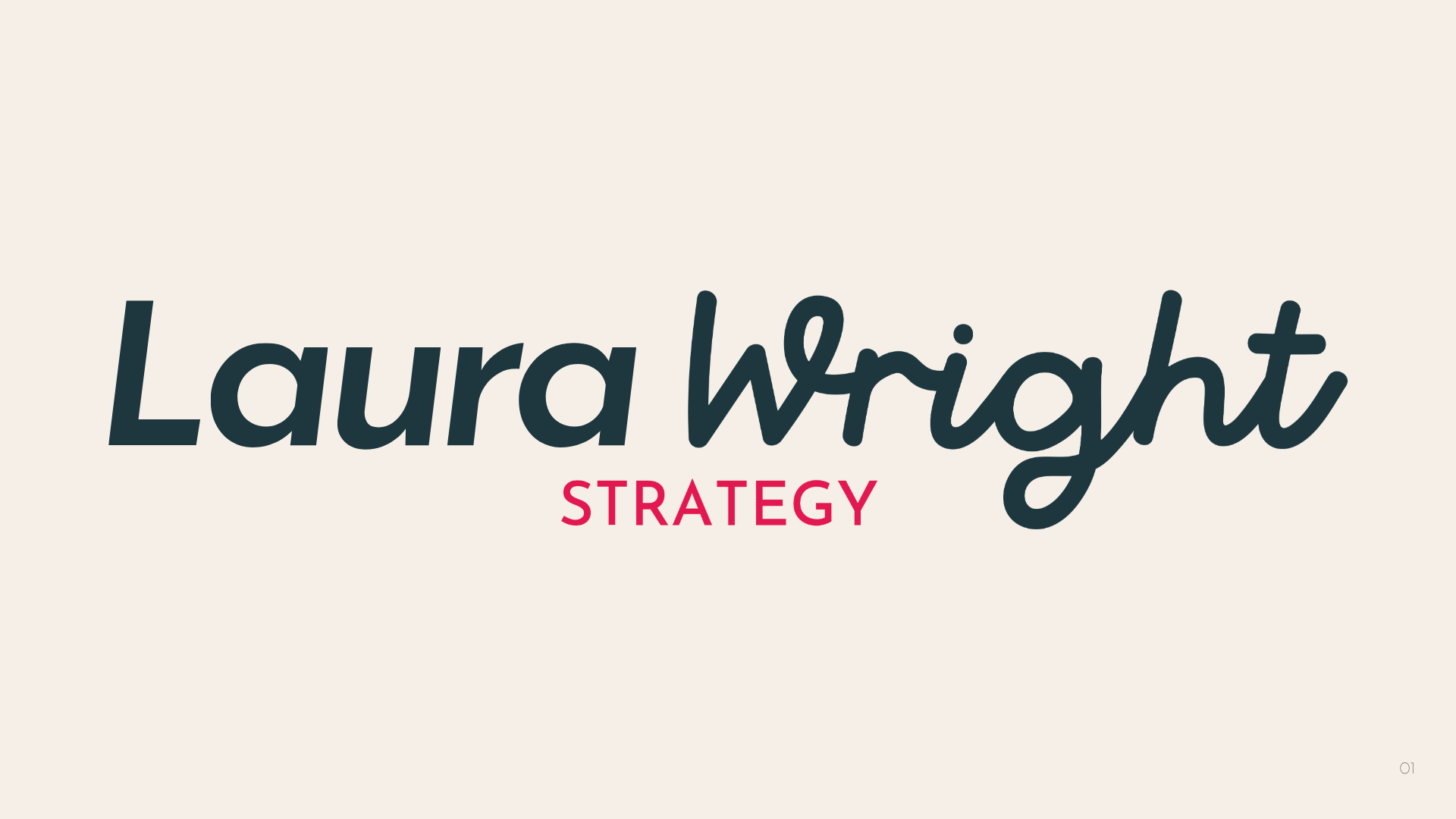
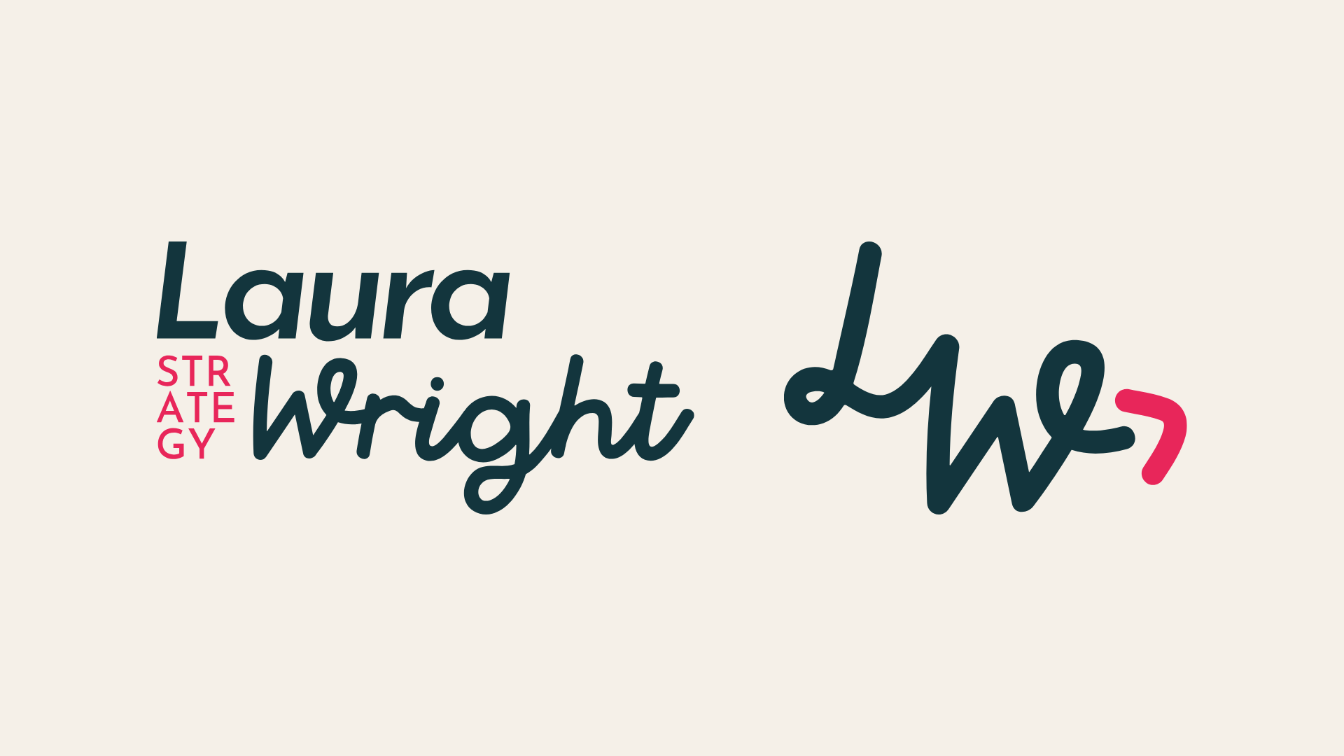
What They GotPrimary logo, secondary logo and logomark, a full colour palette across eight colours, a typography system using Josefin Sans, Rustic Lane and Jost, brand asset illustrations including a grid pattern and hand-drawn line elements, and a full brand guidelines sheet.