

OverviewSarah Westwood is an illustrator whose brand needed to match the energy and joy of her illustration work, bold, warm, colourful and completely full of personality, with her beloved dog Sprocket as a supporting character woven into the identity.
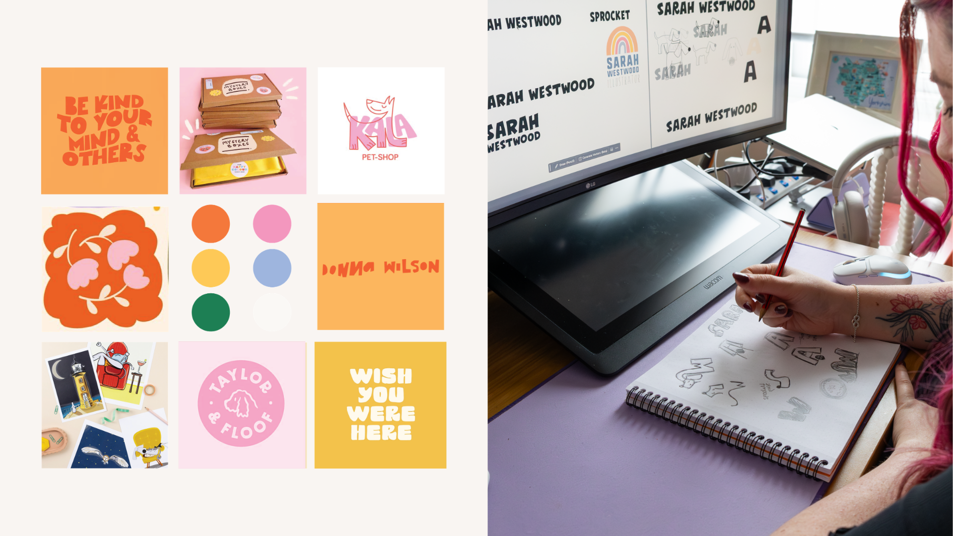
The BriefA full visual identity for Sarah as an illustrator, something that felt as fun and handmade as the work itself, with a complete logo suite, a considered colour palette, brand assets including Sprocket as an illustrated character, and a system that could work across her website, social, stationery and packaging without losing any of its personality at smaller sizes.
The IdeaThe Solskin font sets the tone immediately, bold, rounded and full of character, the kind of type that looks like it was made by someone who genuinely loves what they do, and paired with Josefin Sans in semibold and light it gives the brand real range across headings, subheadings and body copy without ever feeling inconsistent. Orange and Pink lead as the primary colours, warm and energetic, with Yellow, Blue and Green as accents that give each touchpoint room to breathe and vary without the palette ever feeling chaotic.
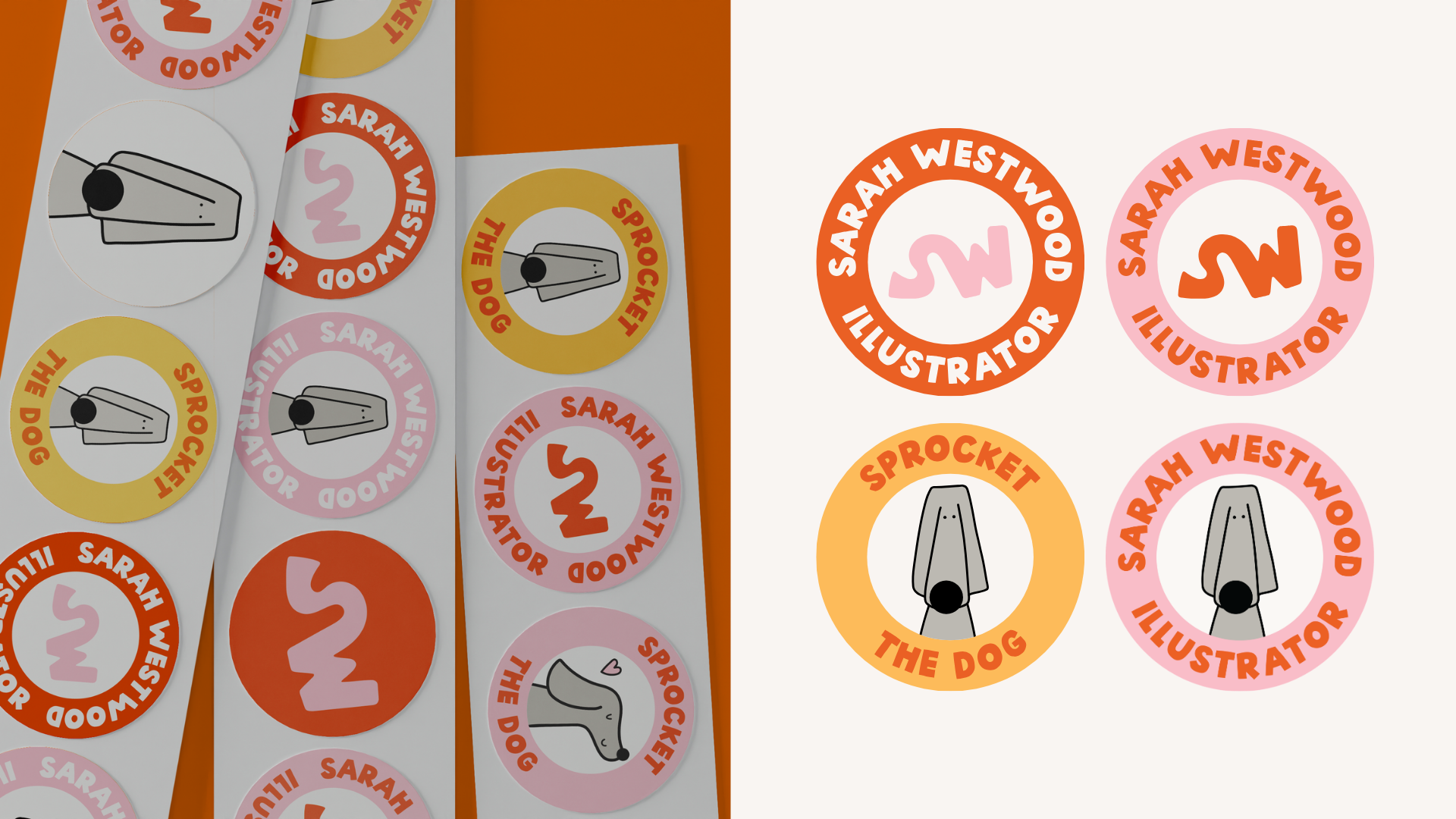
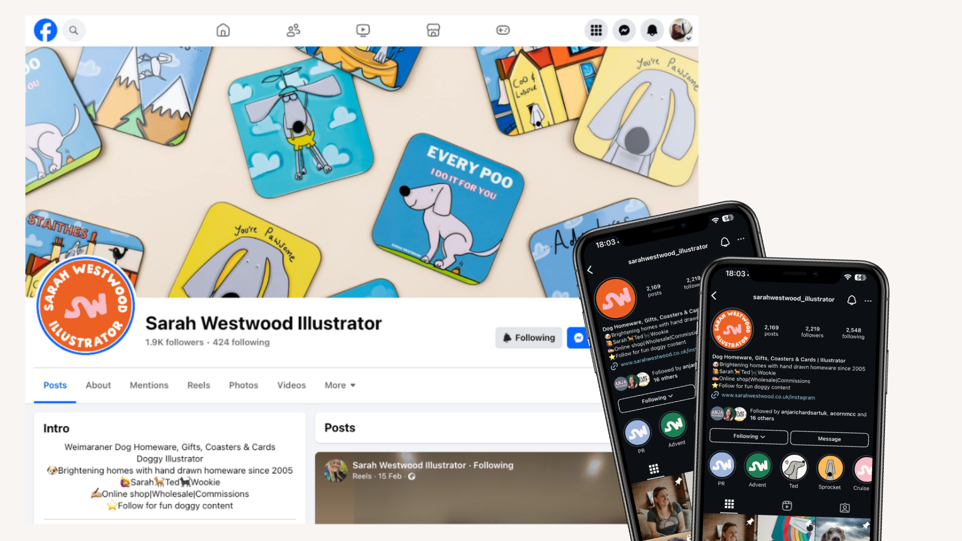
The SuiteThe full logo suite covers every context from website header to wax stamp to Instagram profile picture, and Sprocket gets his own mark alongside Sarah's, sitting in the brand assets as a character illustration that appears across stationery, social and packaging, because a brand that includes your dog is always going to be a brand worth remembering.
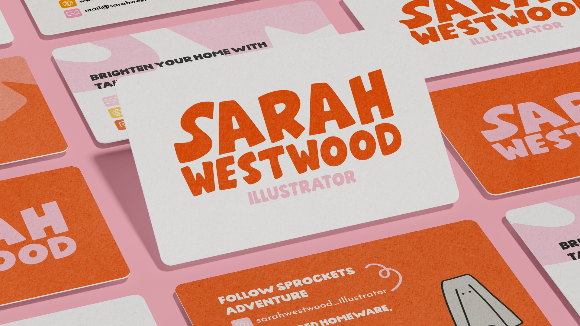
What they gotPrimary logo, secondary logo, submark and logomark, full six colour palette, Sprocket the Dog character illustration and brand assets, typography system across Solskin and Josefin Sans, brand guidelines sheet, website and social mockups.