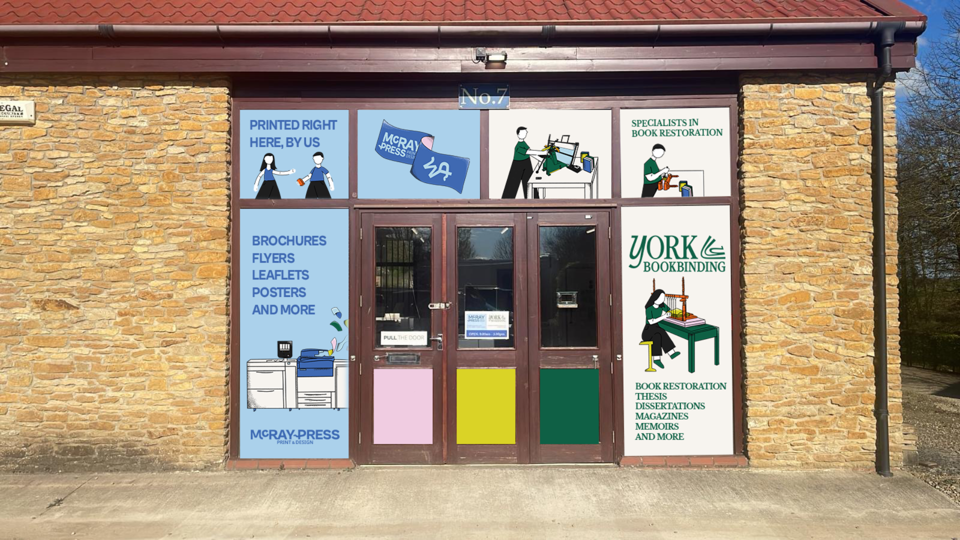
OverviewMcRay Press has been serving Yorkshire businesses and creatives since 1994, founded by Raymond Springall with a name that blends his own story into the brand itself. Ray + Mc for Macintosh. Thirty years of printing done properly, with a personal touch that larger print companies simply can't match. When they came to Notch, the business was solid but the brand wasn't keeping up with who they'd become.
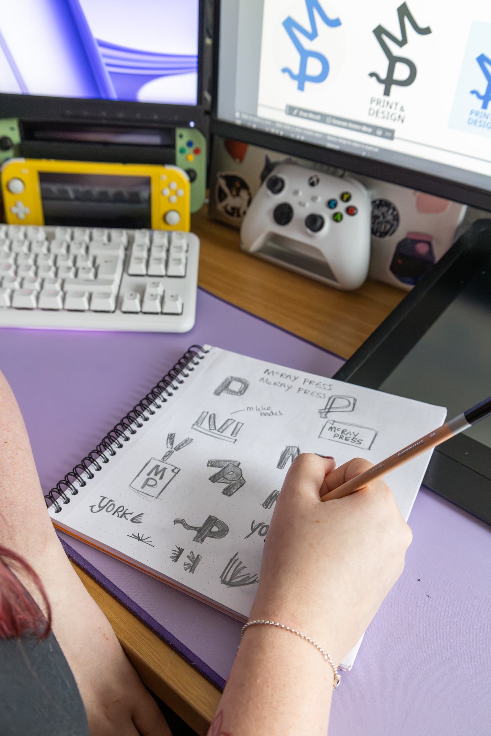
The briefMcRay needed a full brand strategy and creative direction that would modernise the look and feel without losing the warmth and craftsmanship that makes them different. They wanted to appeal to a younger, design-savvy audience alongside their existing business clients, without alienating either.
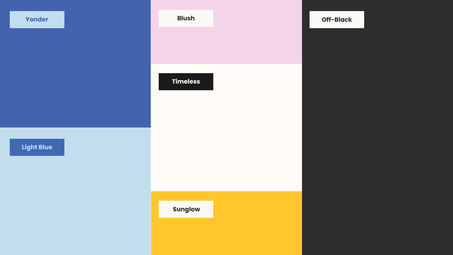
The ideaThe whole industry leans heavily traditional. Muted colours, serif fonts, formal messaging. McRay had an opportunity to do something different. Bold sans-serif type, a vibrant but considered colour palette, and illustration-led visuals that tell a story rather than just list services. Playful, human, and creative. A print business that actually looks like it understands design.
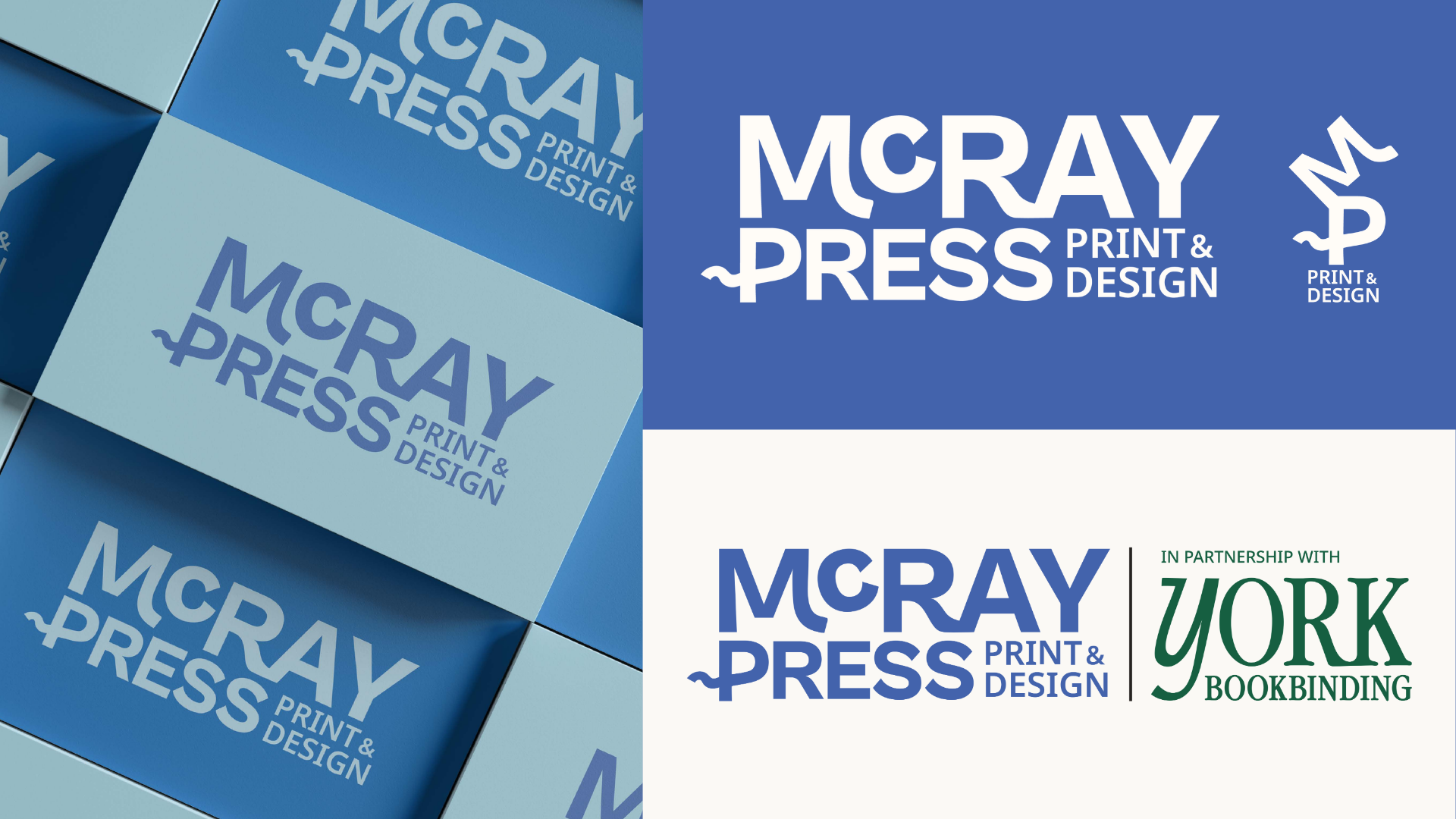
What they gotFull brand strategy document including brand foundations, mission and vision statements, target audience personas, buyer journey mapping, competitor analysis, brand voice guidelines and moodboard direction.
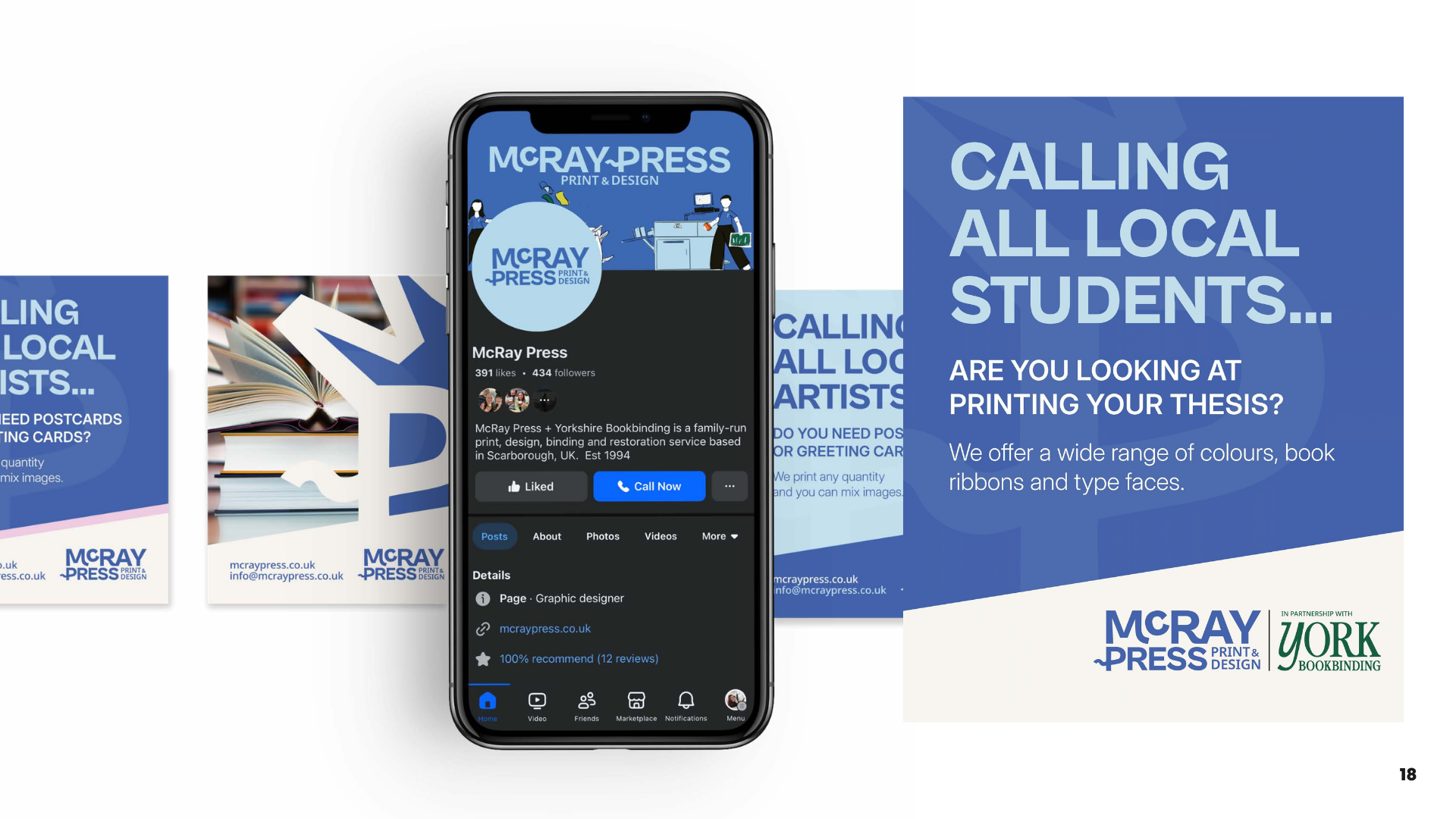
IllustrationsCustom illustrations built specifically for McRay showing the print process through simple, characterful people. A printer, a press, the finished product being handed over. Bold, friendly, and deliberately accessible, designed to make a technical service feel warm and approachable. The illustrated logo flag treatment gives the brand a tactile, handmade quality that sits perfectly against the bold sans-serif type.