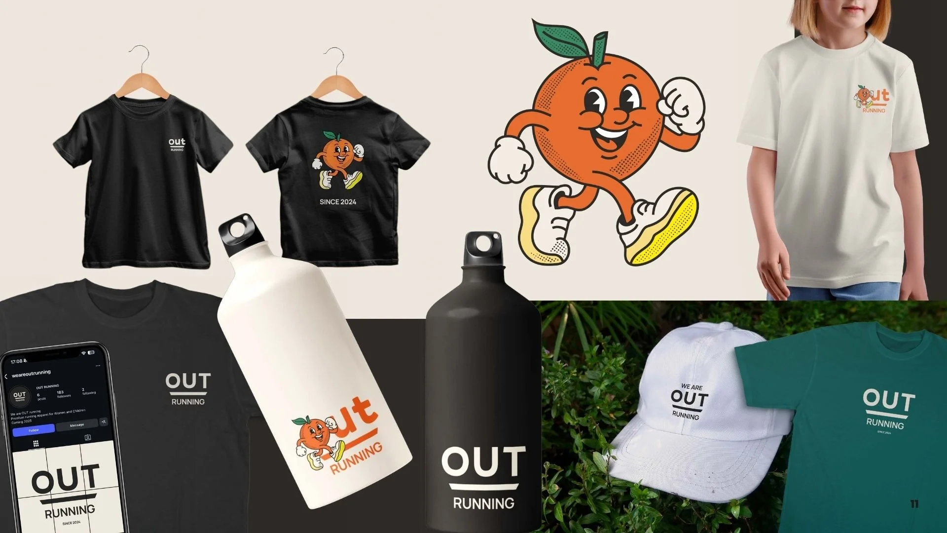
OverviewOut Running is a premium running apparel brand for women and children, launched in 2024 with a clear belief that running kit should feel as good as it looks and that there was space in the market for a brand that spoke to both mums and kids without either feeling like an afterthought.
The briefA full visual identity that could work across two distinct audiences, a women's brand that felt premium, considered and grown up, and a kids brand with its own character, energy and colour world, both sitting under the same Out Running name without one feeling diluted by the other, and a system that could translate onto actual apparel, t-shirts, water bottles, caps and everything in between.
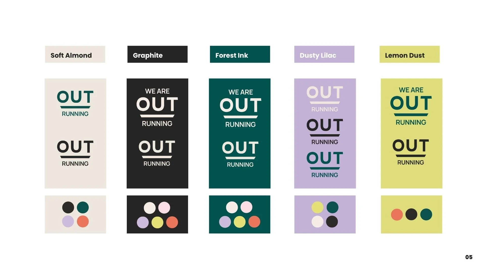
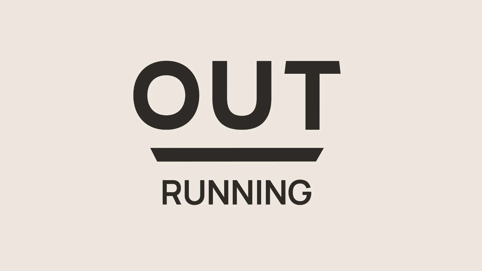
The IdeaThe two logos do very different things while staying in the same family. The adults mark is clean and typographic, bold and confident, with a strong underline device that works brilliantly when embroidered onto a cap or printed on a water bottle. The adults palette stays sophisticated, with the two worlds connected by Soft Almond and Graphite running through both.
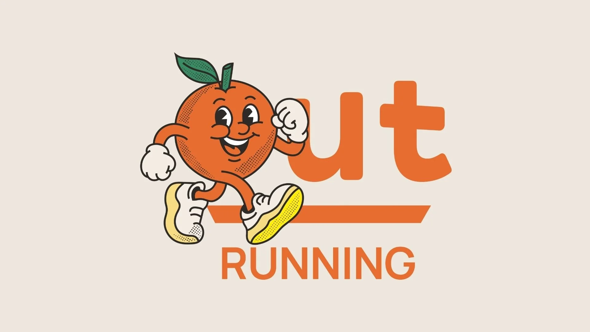
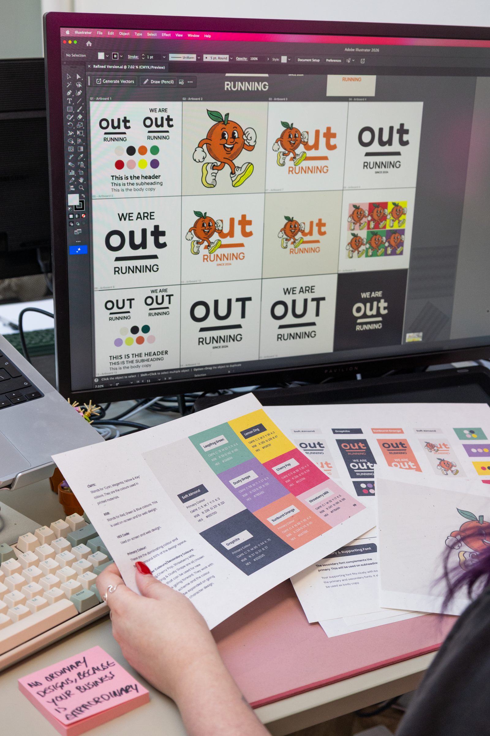
The IdeaThe kids version brings in the illustrated orange character, retro, full of energy and genuinely joyful, the kind of mascot kids actually want on their t-shirt. The character palette was deliberately built with expansion in mind, so new characters can be added as the running colours go forward.
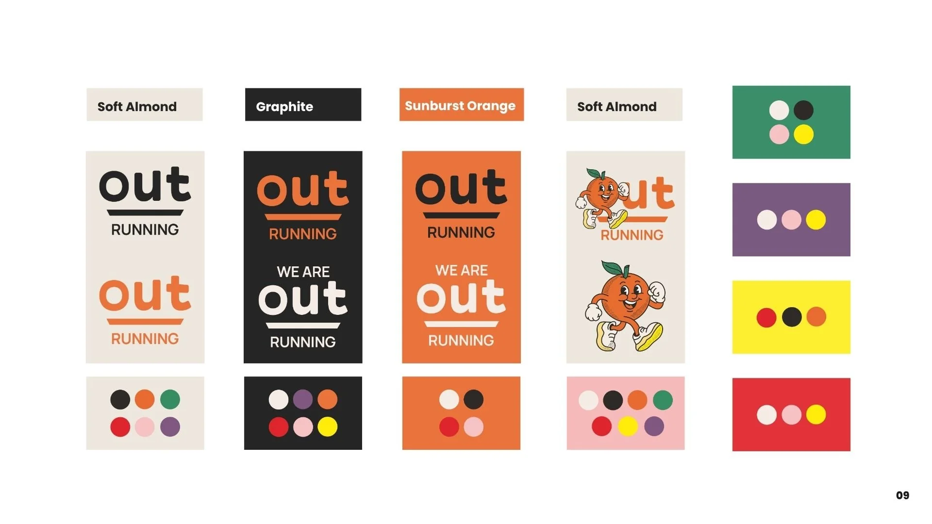
What they gotAdults logo suite, kids logo suite with illustrated orange character, two distinct colour palettes with expansion guidance for future character colours, typography system, brand guidelines, mockups across t-shirts, water bottles, caps and social.