

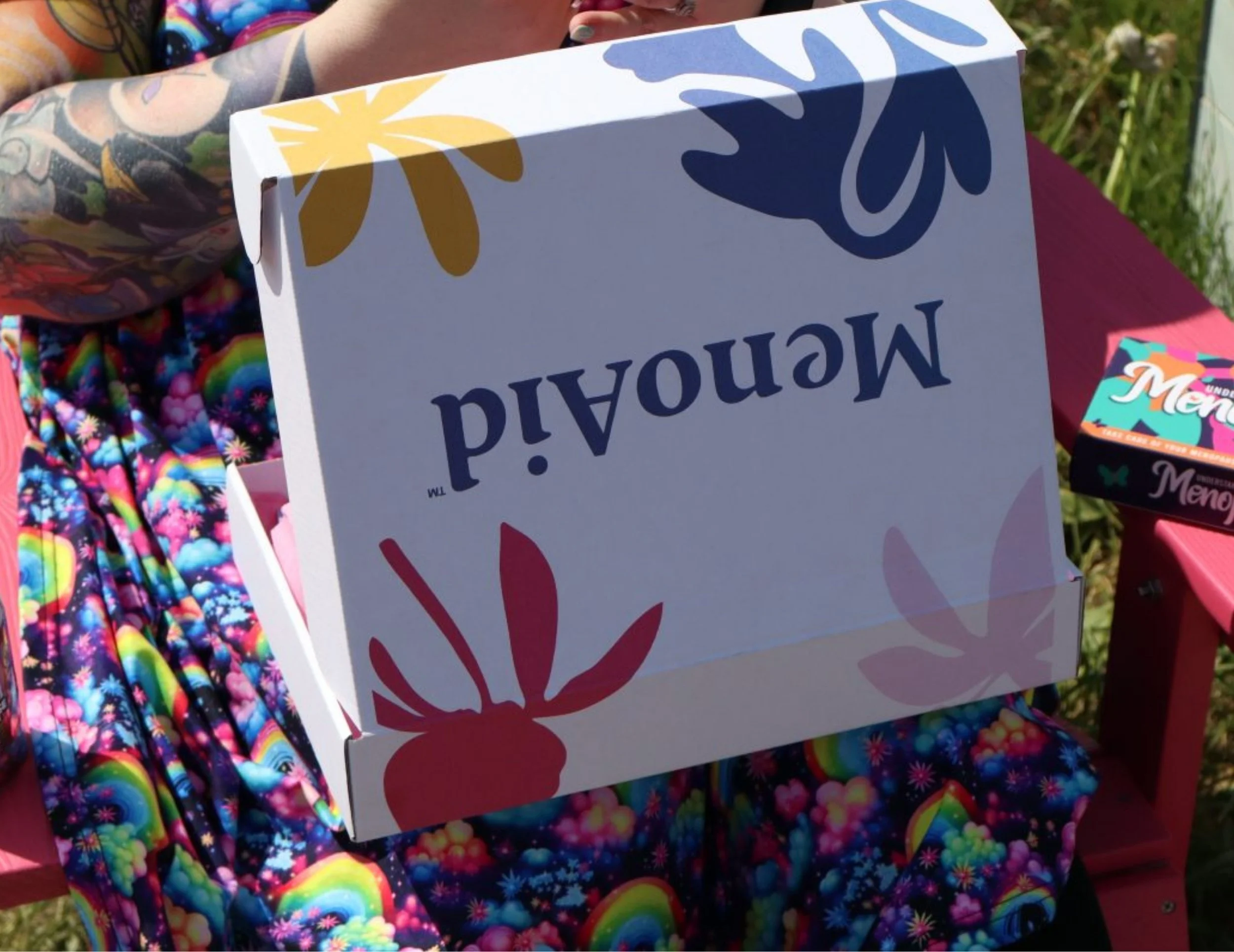
OverviewMenoAid is a subscription box built around something that doesn't get talked about nearly enough. Menopause. Not just the kind that comes with age, but early menopause, perimenopause, surgical menopause, the kind that arrives decades before anyone expects it and with very little support around it. Founded by Naomi, MenoAid exists to fill the gap in information, community and care that so many women fall into.
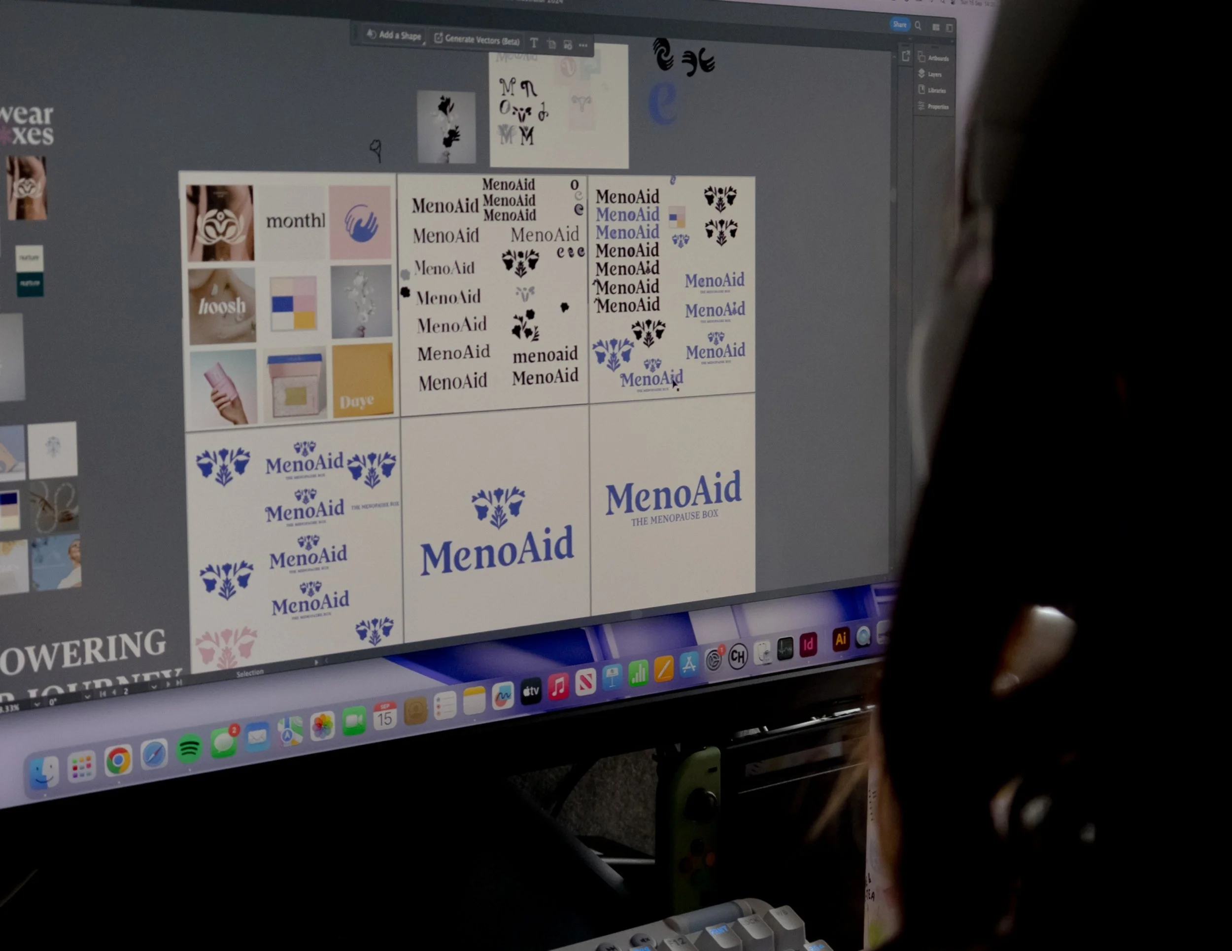
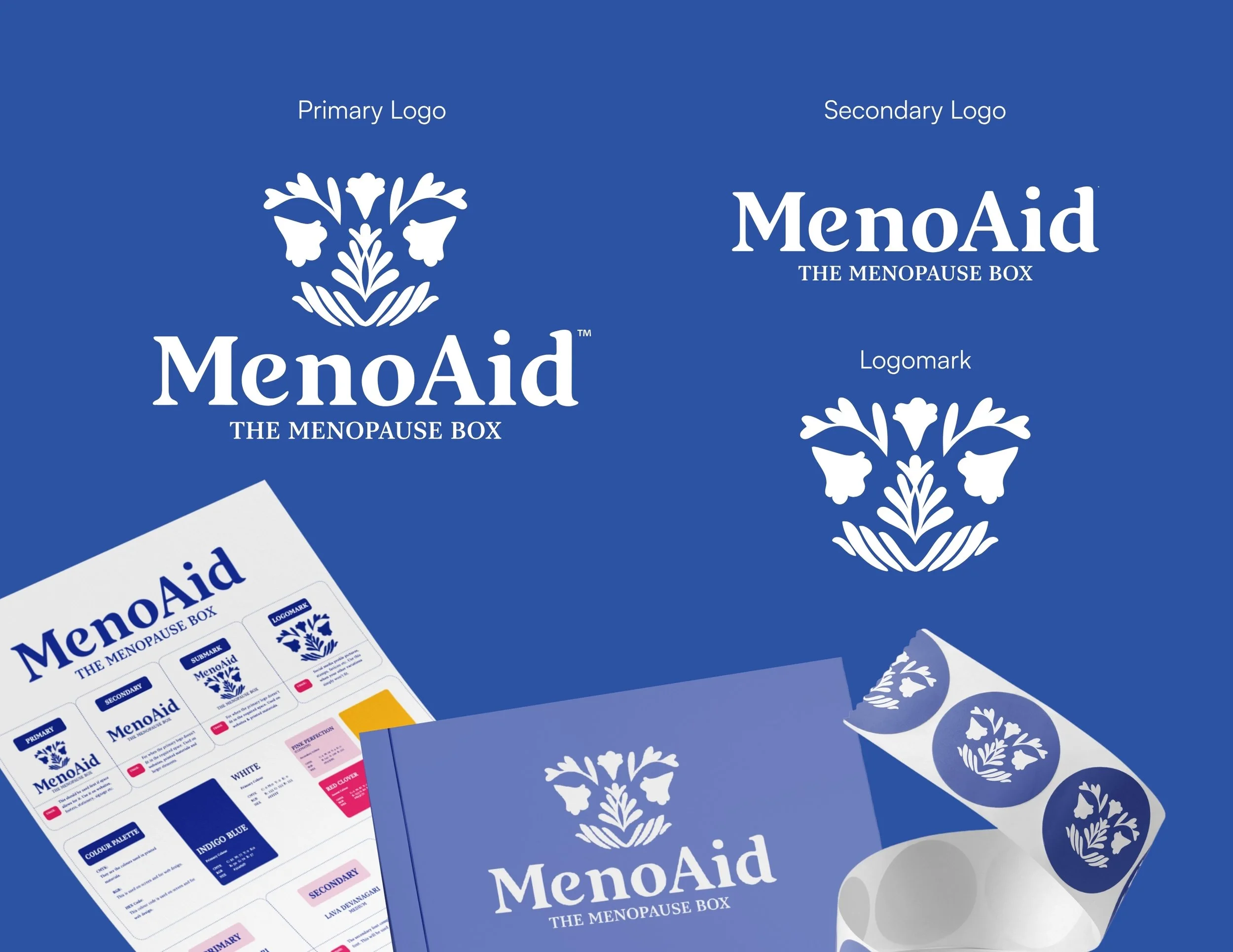
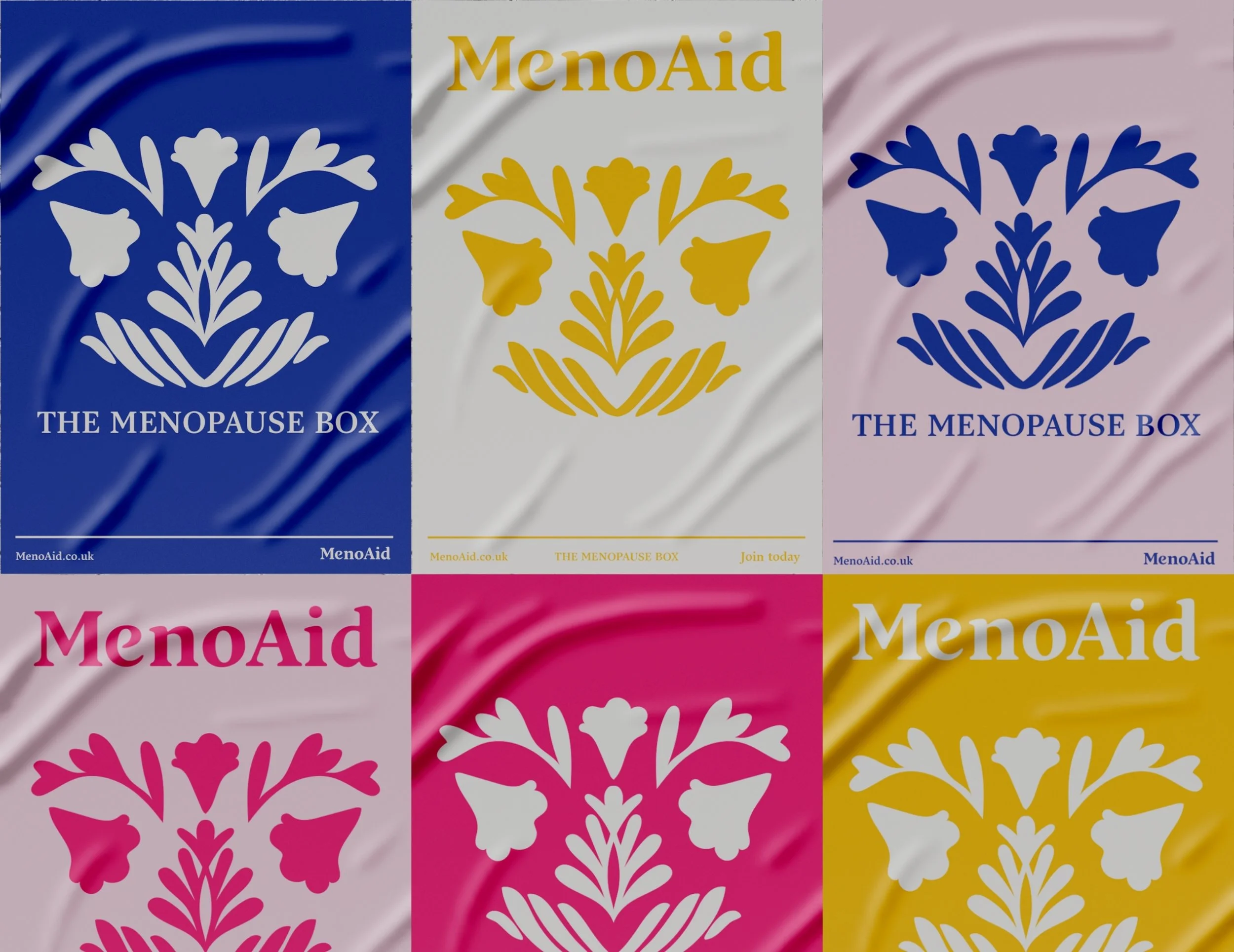
The BriefNaomi came with a clear vision and a lot of heart. She wanted something feminine and considered without being obvious or exclusionary. The brand needed to feel like it was for women, without saying it in a way that felt dated. She loved the idea of using floral imagery to represent the uterus, something symbolic and pretty rather than clinical. The name itself, MenoAid, was chosen deliberately. Menopause, plus help. Simple, honest, and exactly what the brand stands for.
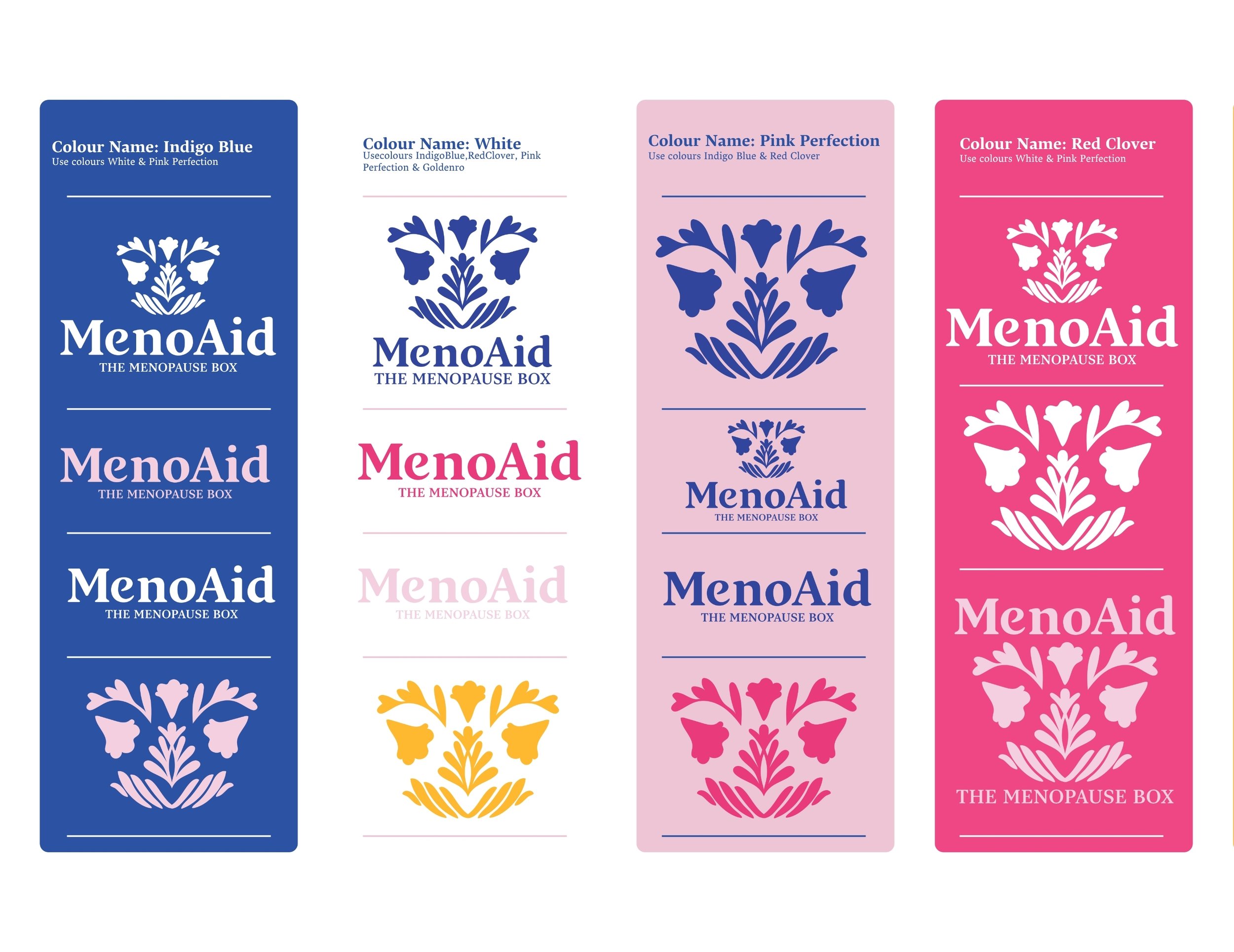
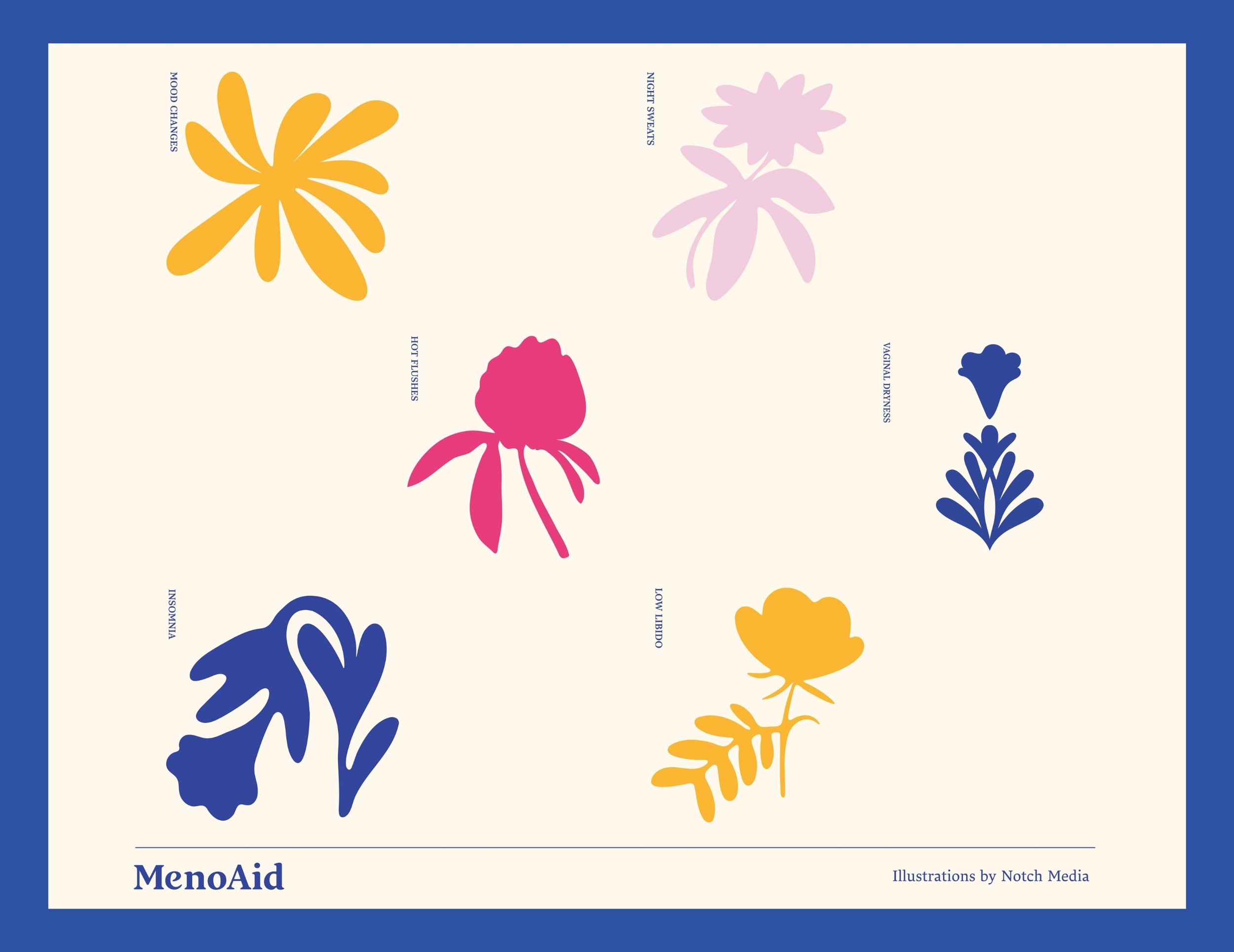
The IdeaThis was the project that made me realise what personality-led branding could really do. Naomi's story wasn't background context, it was the brand. Her nana, her mother, her own diagnosis, the fight against a culture that tells women to just get on with it. All of that needed to live somewhere in the identity, not loudly, but quietly and with intention. The floral uterus concept gave us a way to do that. Something beautiful and unmistakably feminine, rooted in something real, without ever feeling like a medical diagram or a stereotype.
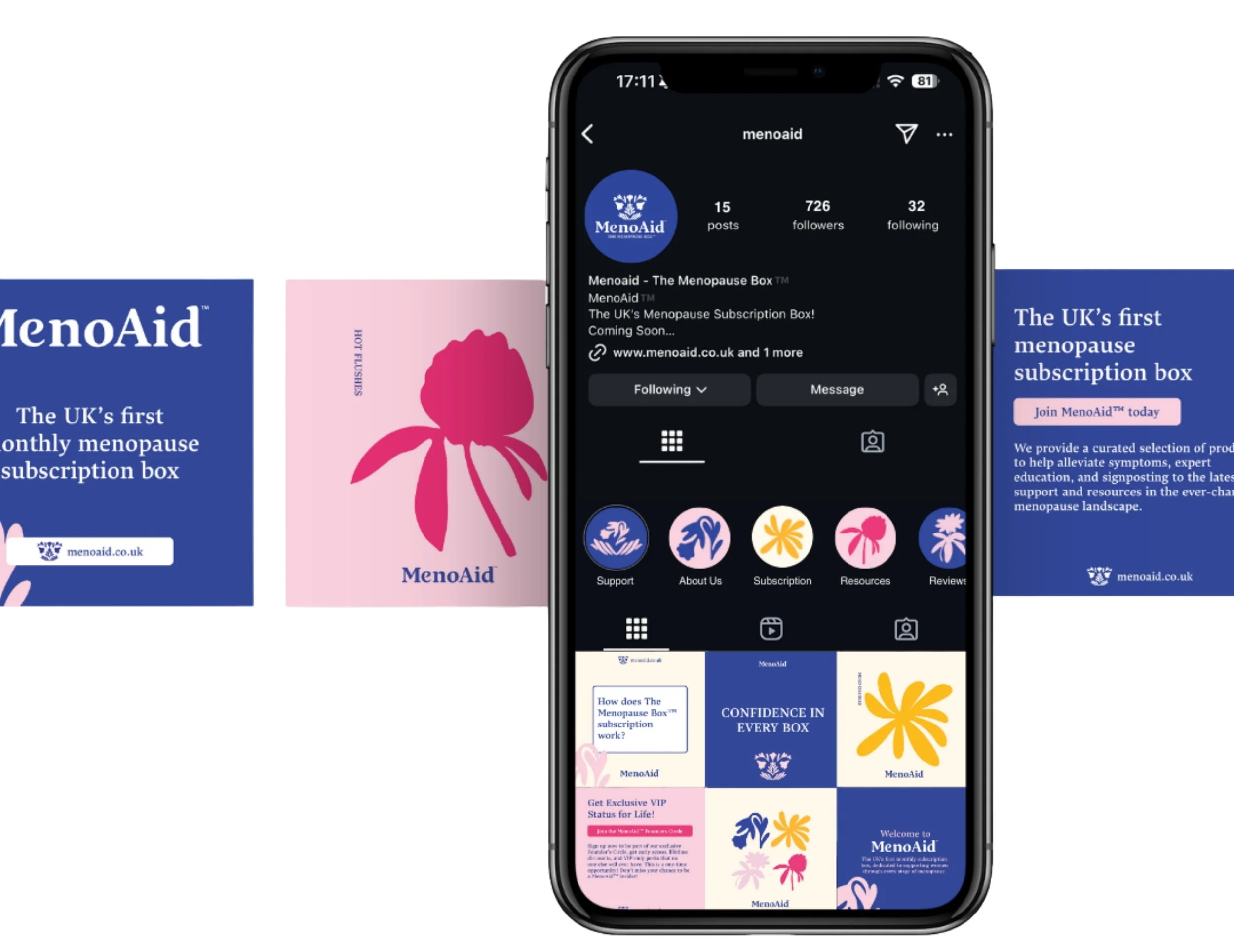
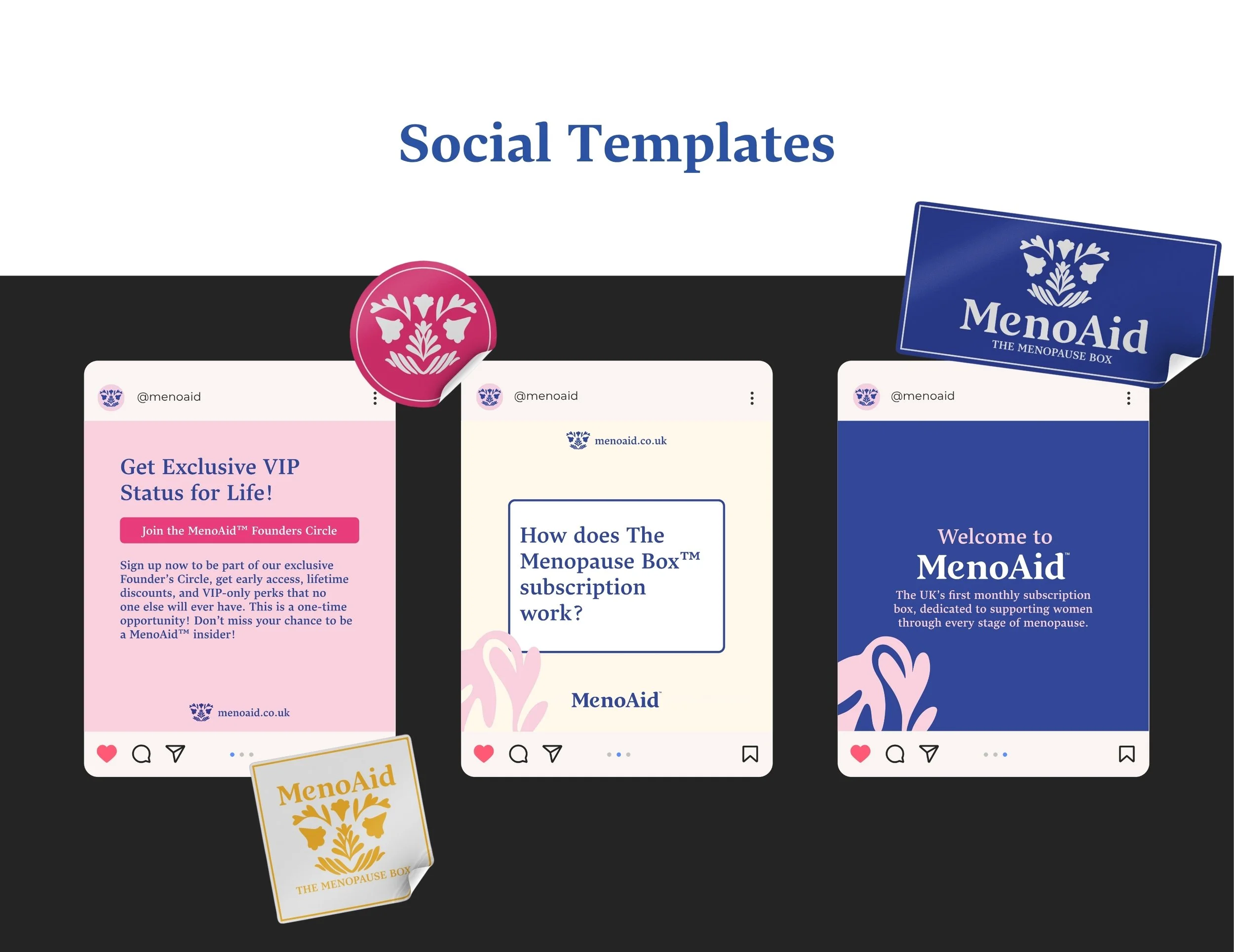
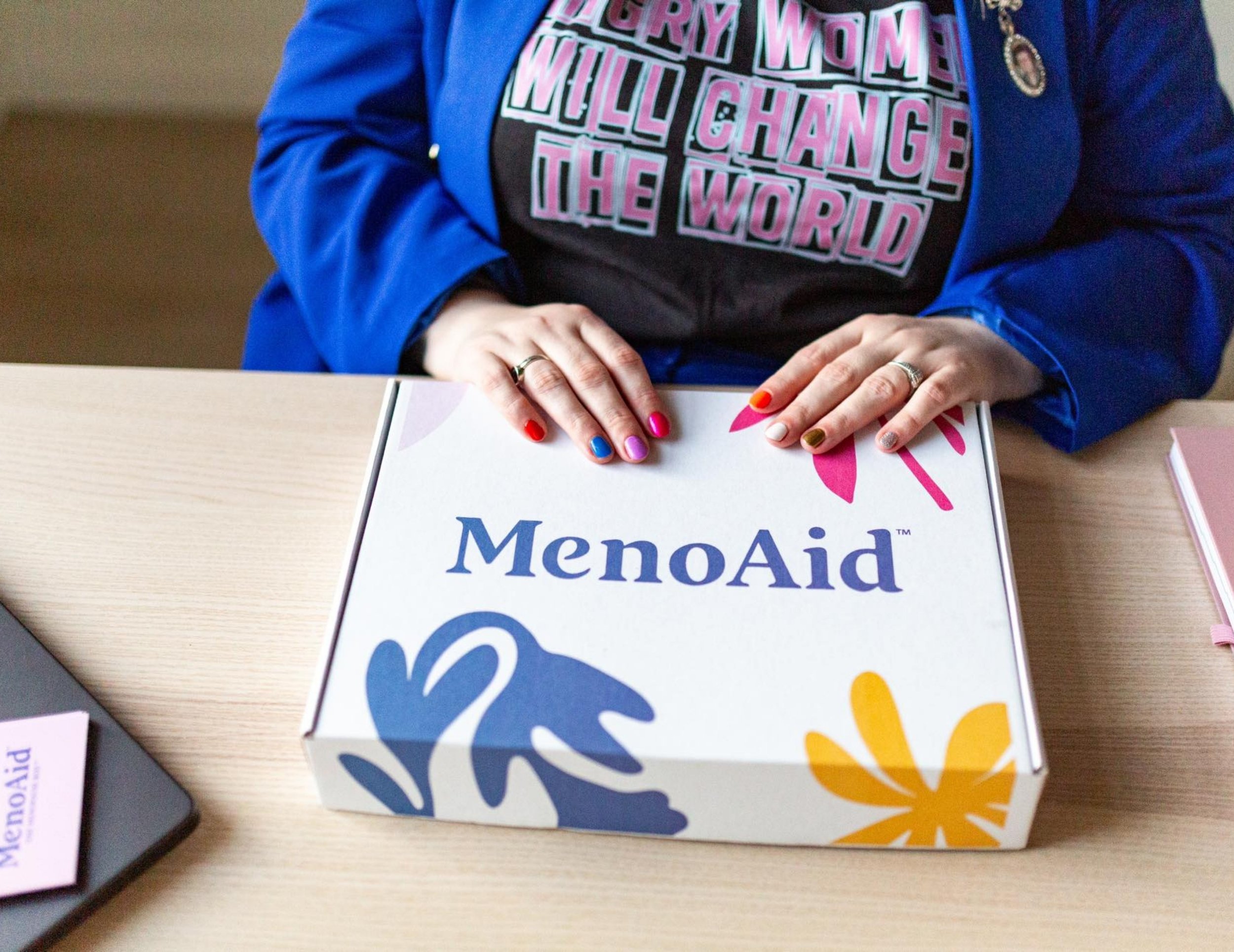
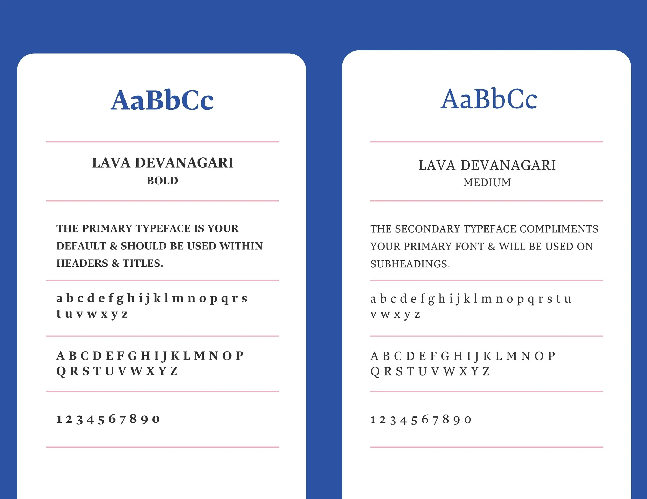
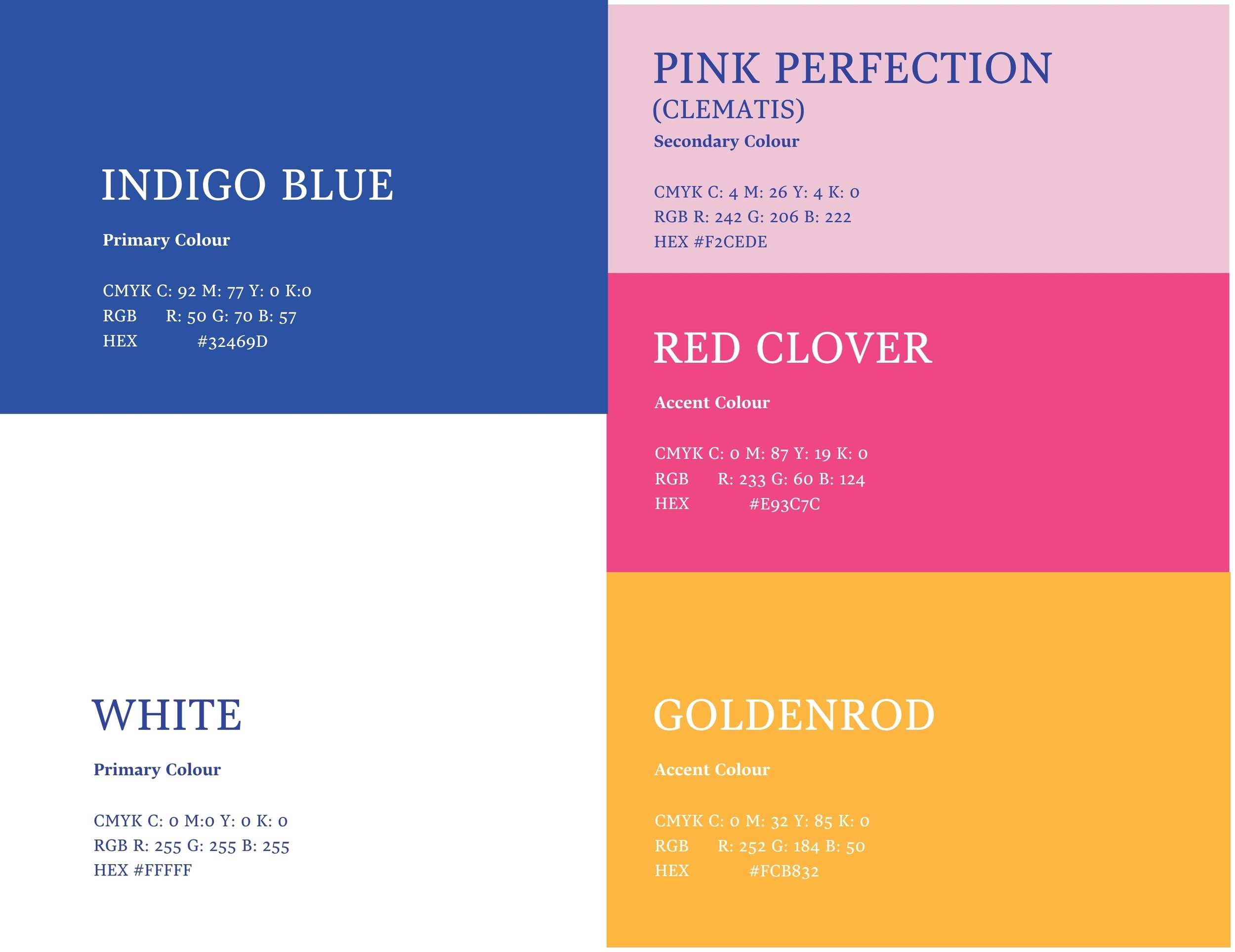
What they gotBrand strategy including target audience personas, competitor analysis, brand personality framework and moodboard direction.