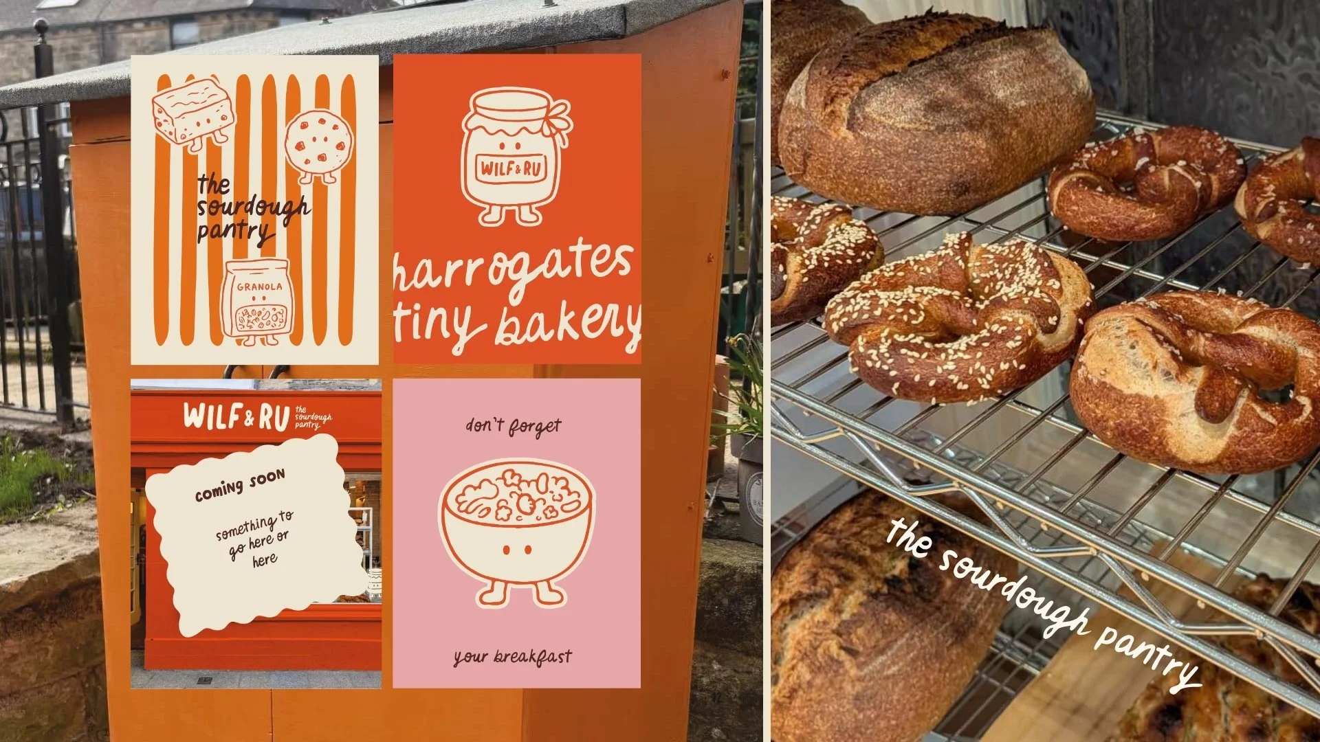
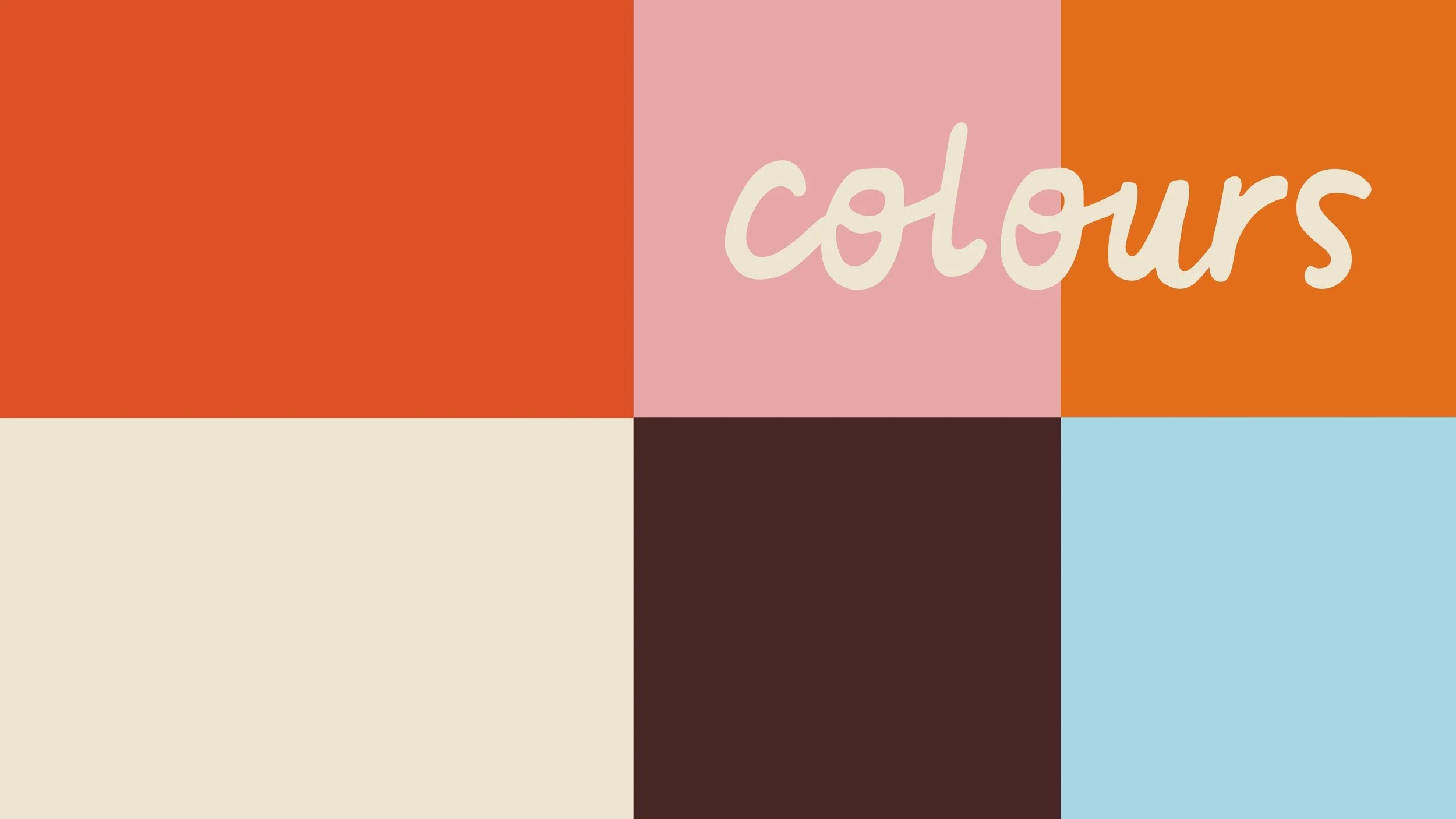
OverviewWilf & Ru is a home sourdough bakery named after the owners' two boys, with big plans to grow into a full sourdough pantry, think bread and bakes alongside granola, crackers, snack bars and fermented veggies. They came to me wanting something bold and colourful, built around their orange, that could be a small part of the moments that make life special.
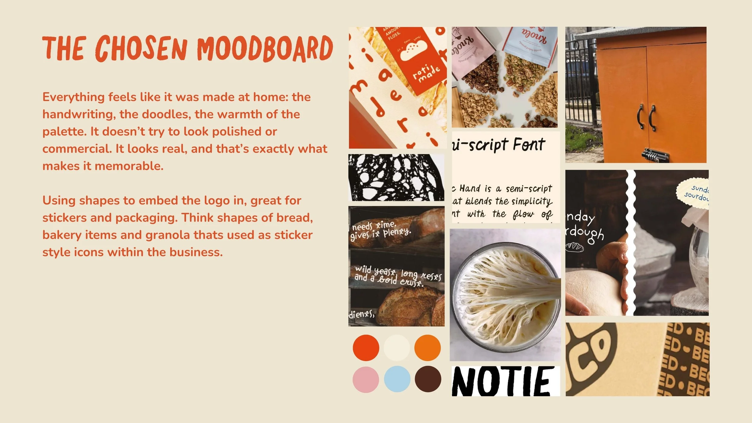
The briefTheir brand personality test came back as The Caregiver, warm, nurturing, trustworthy, generous and community-led, and honestly you could feel all of that in the first conversation. The challenge was making something bold enough to stand out on a shelf without losing the homemade heart of it.
The ideaThis direction puts the family at the very centre of the brand, not as a tagline but as its visual DNA. The bakery is named after two kids, so everything feels like it was made at home: the handwriting, the doodles, the warmth of the palette. It doesn't try to look polished or commercial. It looks real, and that's exactly what makes it memorable.
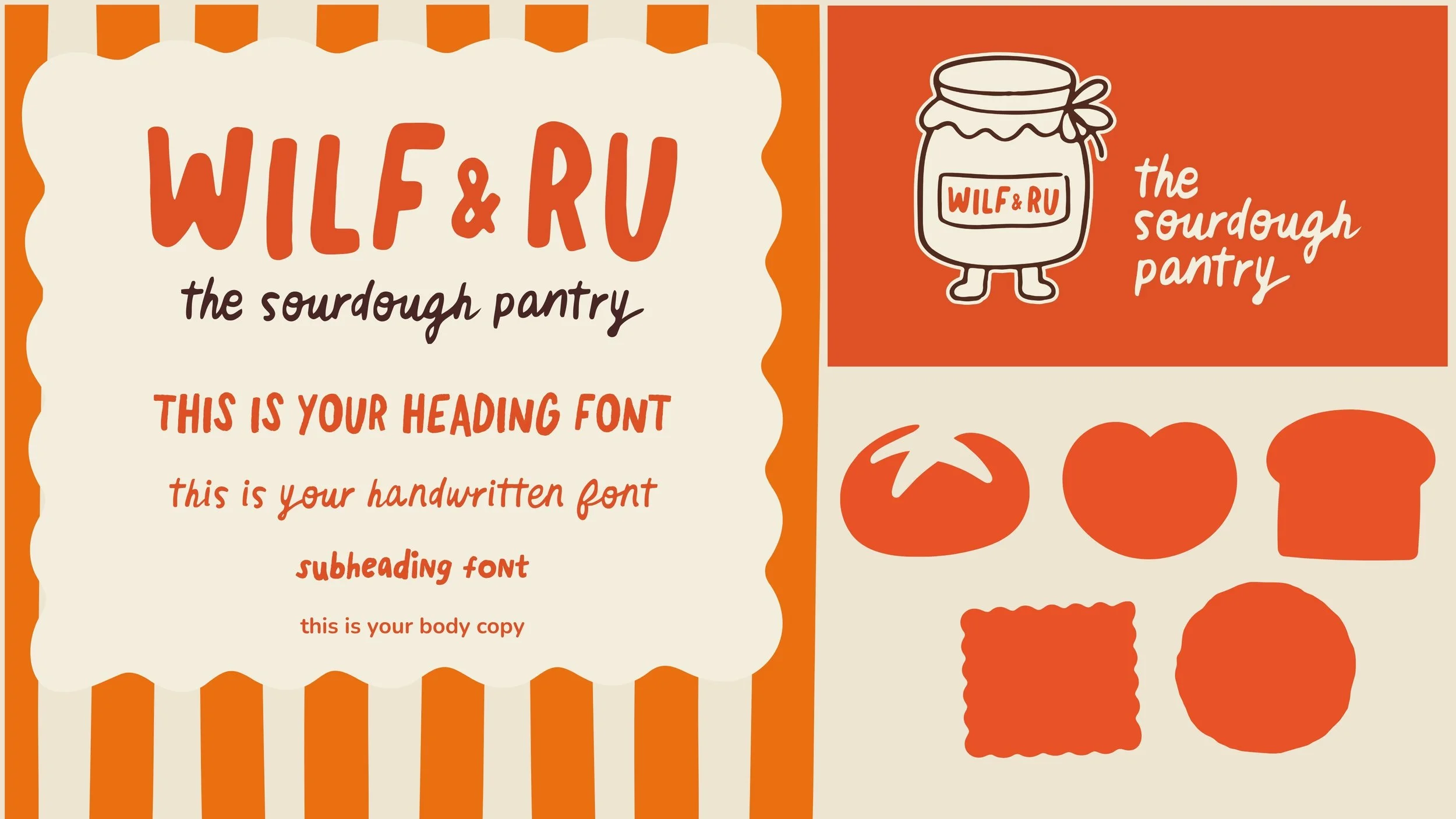
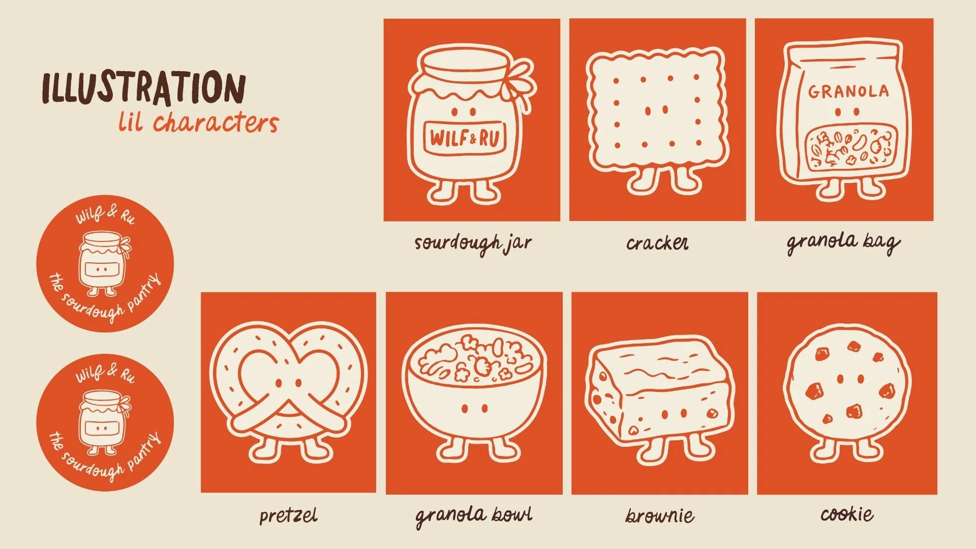
The Lil CharactersEvery product gets its own little character, wobbly legs, a friendly face, that slightly wonky hand drawn line. The brand doesn't just tell you it's homemade, it shows you at every touchpoint. These aren't illustrations sitting on top of the brand, they are the brand, the kind of thing kids would draw on a lunchbox and grownups would genuinely want as a sticker.
What they gotA full logo suite, a family of illustrated characters and brand assets, and four social media templates to get them posting from day one.